May 31, 2026
Brand Mascot vs Brand Character: Which One Should You Build?
Understand the difference between a brand mascot and a brand character, then choose the right visual system for your product, app, or SaaS brand.
People use “brand mascot” and “brand character” interchangeably, but they are not quite the same thing.
A mascot is usually a recognizable representative: the face of a product, team, community, or campaign. A brand character is broader. It is a designed personality system that can show up in different poses, stories, channels, and product moments.
The difference matters because the thing you choose changes what you need to build.
The Short Difference
A brand mascot is the character people remember.
A brand character system is the set of rules, poses, expressions, colors, and behaviors that make the character usable across a real brand.
If you only need a memorable face for marketing, a mascot may be enough. If you want the character to appear across onboarding, docs, ads, product UI, and social posts, you need a character system.
What a Brand Mascot Does Best
A mascot is strongest when recognition matters.
It gives your brand a shape people can remember faster than a wordmark. It creates a shortcut: “the penguin,” “the owl,” “the fox,” “the robot,” “the panda.”
Mascots are especially useful for:
- developer tools
- educational apps
- consumer subscriptions
- communities
- open-source projects
- products with abstract value propositions
If your product is difficult to explain visually, a mascot gives people something concrete to hold onto.
What a Brand Character System Does Best
A character system is strongest when consistency matters.
It answers questions like:
- How does the character look when happy, confused, or helpful?
- Which poses belong in product UI?
- Which colors can change with brand themes?
- How much detail is allowed at small sizes?
- Can the character appear with props?
- What topics should the character never joke about?
This is what keeps a mascot from becoming a random sticker collection.
Example: A Mascot With Strong Recognition
Source: Tux Classic flat look. Tux originally by Larry Ewing, with later SVG work credited on Wikimedia Commons.
Tux is a useful example because the silhouette is instantly recognizable. The character does not need a complex scene to communicate identity. That is mascot power: a simple shape carrying a lot of brand memory.
But if you were building a product UI around Tux-like character usage, you would still need system rules: error poses, onboarding poses, size limits, color handling, and usage guidelines.
Choose a Mascot If…
Choose a mascot-first approach if:
- you need a memorable brand symbol quickly
- your product needs more warmth on marketing pages
- you are launching a community or open-source project
- you only need a few core illustrations
- you do not yet know all product use cases
In this case, design one excellent character and a small set of flexible poses.
Choose a Character System If…
Choose a system-first approach if:
- the character will appear inside the product
- multiple designers or marketers will use it
- you need consistent illustrations for many screens
- the brand will run campaigns across channels
- the character needs to scale with the company
In this case, invest in rules early. You do not need a huge brand book, but you do need constraints.
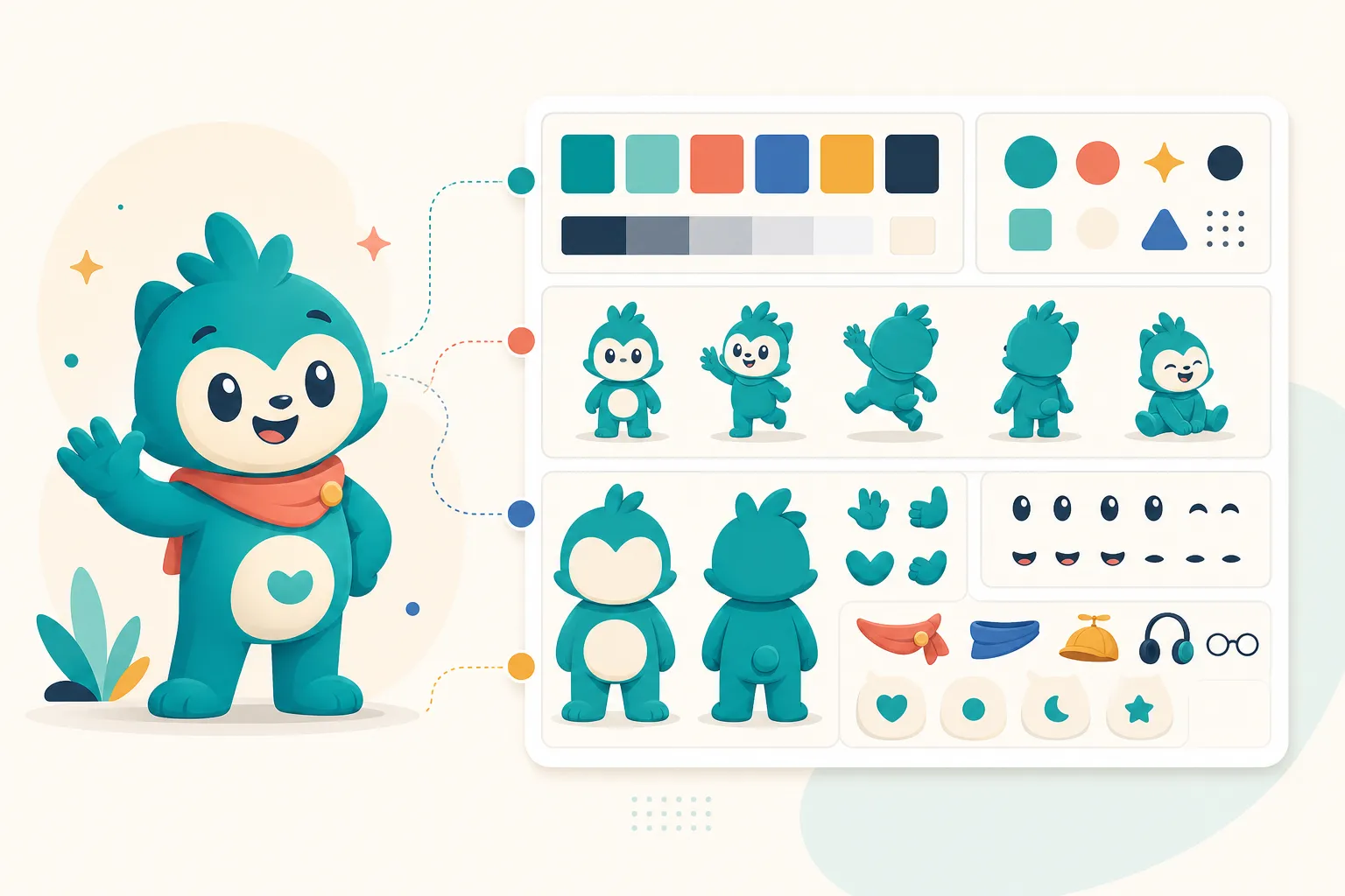
The Minimum Viable Brand Character System
A small team can start with this:
1. Character Sheet
Front view, side-ish view, facial details, color palette, and proportions.
2. Pose Library
Five to ten poses covering welcome, explain, think, celebrate, error, and help.
3. Usage Rules
Where the character appears, where it does not, what tone it should carry, and how large it should be.
4. Color Rules
Which colors are fixed and which can adapt to the brand palette.
5. Voice Notes
If the mascot “speaks” in copy, define whether it is playful, calm, technical, cheeky, or purely visual.
Create a brand character that can scale
Generate consistent mascot poses, brand colors, and reusable SVG assets for your product identity.
Build Your MascotThe Most Common Mistake
The most common mistake is designing a mascot as if it will stay on the homepage.
Then the team starts using it everywhere: a sales deck, a 404 page, a help article, a launch post, a pricing modal. Every new use creates a new drawing. Eventually the character changes shape, color, and personality.
That is not a mascot problem. It is a system problem.
The Practical Recommendation
For most modern SaaS and app teams, the answer is:
Start with a mascot, but design it as the seed of a character system.
That means you do not need fifty poses on day one. But you should design the first five with future consistency in mind.
Ask:
- Can this character express more than one emotion?
- Can it work in small product UI?
- Can it appear with props?
- Can a new pose be generated or illustrated without changing the identity?
If the answer is yes, you are not just making a cute mascot. You are building a brand asset that can compound.