6 Brand Mascot Design Trends for 2026
See six mascot trends shaping 2026, with real examples from Duolingo, Asana, Mailchimp, and WordPress plus a practical brand character checklist.
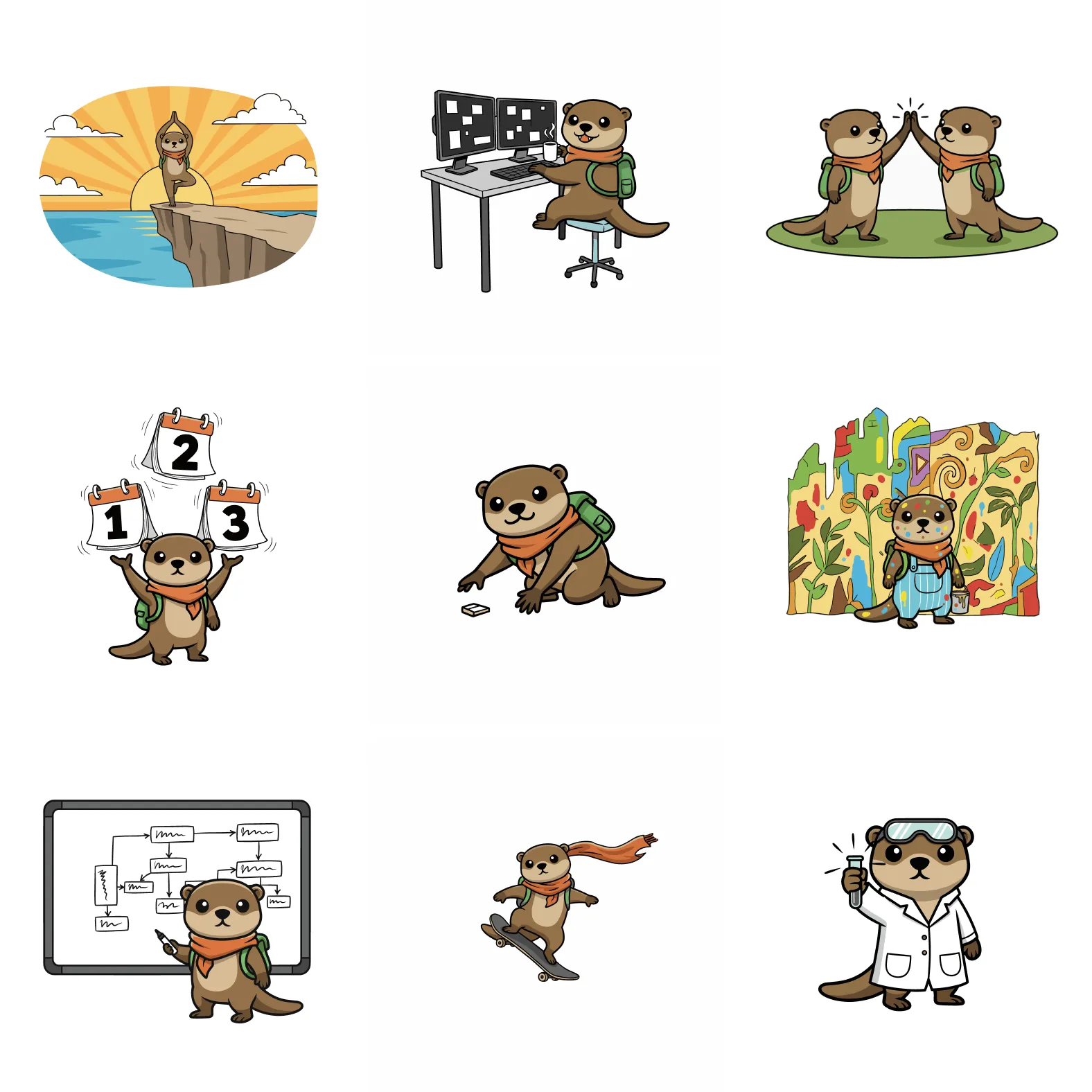
The strongest mascot design trends of 2026 are not just visual styles. They are practical choices that make a brand character easier to recognize, animate, and reuse.
This guide breaks down the six trends worth applying now, using official examples from Duolingo, Asana, Mailchimp, and WordPress alongside research on distinctive brand assets and brand anthropomorphism.
A mascot is only useful if it does at least one of these things well:
- Increases recognition
- Makes the brand feel warmer or more memorable
- Adapts across product, marketing, social, and community touchpoints without falling apart
The pattern across those examples is clear: 2026 is not about copying one dominant illustration style. It is about building a mascot system that is distinctive, emotionally flexible, and usable everywhere.
The 6 Mascot Design Trends at a Glance
Here is the short version for teams choosing or refreshing a brand character:
| 2026 trend | What it means | Example |
|---|---|---|
| Distinctive silhouettes | Shape and stable features matter more than generic cuteness | Duolingo’s Duo |
| Human-made texture | Authored details beat anonymous, over-smoothed polish | Mailchimp’s Freddie |
| Emotional systems | A reusable expression library beats one hero pose | Duo across product and marketing |
| Supportive behavior | The mascot guides and reassures instead of judging the user | Asana’s celebration creatures |
| Community remixing | Clear rules allow new variations without losing recognition | WordPress’s Wapuu |
| Motion-ready design | The character works as a still, sticker, loop, and UI reaction | Duolingo’s in-lesson animations |
For app, SaaS, and product teams, the practical takeaway is simple: treat your mascot as a reusable brand character system, not a one-off campaign illustration. If you are still deciding what kind of character fits your product, start with the brand mascot planning guide or compare a mascot against a simpler logo or icon system.
Brand Mascot Trend Checklist for 2026
Use this checklist when reviewing a new mascot concept, refreshing an existing character, or briefing a designer:
| Trend | What to check | Why it matters |
|---|---|---|
| Distinctive shape | The mascot is recognizable without the logo | Better memory and faster recognition |
| Stable character rules | Face, proportions, colors, and posture stay consistent | Easier reuse across product and marketing |
| Emotional range | The mascot has poses for welcome, support, errors, success, and launch moments | More useful than one hero pose |
| Motion readiness | The design can become stickers, short loops, and tiny UI reactions | Fits modern feeds and app surfaces |
| Community flexibility | Variations are allowed without losing the core character | Keeps the mascot alive beyond the brand team |
| Product relevance | The mascot explains, reassures, or celebrates at real user moments | Avoids decorative mascot clutter |
If you need examples of product-specific applications, the app mascot placements guide maps where mascots help inside onboarding, empty states, errors, and upgrade flows.
Mascot Design Trends vs. Character Design Trends
Character design trends usually focus on appearance: shape language, color, texture, rendering style, and personality cues. Mascot design trends include those decisions, but add a stricter brand requirement: the character must stay recognizable after repeated use and adaptation.
A successful mascot needs stable rules for its silhouette, face, proportions, colors, and behavior. Its poses, expressions, motion, seasonal versions, and campaign treatments can change. That distinction is why a fashionable character illustration is not automatically a durable brand mascot.
1. Distinctive Mascots Beat Merely Cute Mascots
The biggest 2026 trend is not “cute animals” or “hand-drawn lines.” It is distinctiveness.
Ipsos and JKR’s distinctive asset research found that mascots can be strong memory structures, but very few actually reach that bar. In one Ipsos summary, only 16% of mascots qualified as gold-standard distinctive assets. That is the real market signal: most mascot work does not fail because mascots are outdated. It fails because the character is not recognizable enough to function as an asset.
That changes how you should judge mascot design:
- Can people recognize the character from silhouette alone?
- Does the face read at favicon, sticker, and social thumbnail size?
- Are the proportions, eyes, colors, or posture ownable enough to survive without the wordmark?
Duolingo is a useful official example here. In its reshaping Duo write-up, the team describes refining the owl’s shape and silhouette while preserving the core species, color, and recognizable personality. That is a better model than endlessly adding detail. Strong mascots get clearer as they scale, not more complex.
Example: Duolingo keeps Duo recognizable across contexts
Duolingo’s official marketing assets show the same core character working across multiple brand contexts without losing recognizability.
Sources: Duolingo Marketing Assets, Reshaping Duo, Ipsos on brand mascots.
2. Human-Made Texture Is Winning Against Generic Smoothness
The visual shift people often describe as “imperfectly human” is real, but it needs a better explanation than “rough is in.”
Adobe’s Creative Trends 2026 frames the year around balancing authenticity and innovation. My inference from that report is that mascots now benefit from visible human intent: slightly uneven lines, tactile shapes, restrained color fields, or a drawing style that feels authored rather than machine-smoothed into sameness.
That does not mean sloppy execution. It means leaving enough texture for the mascot to feel lived-in and specific.
Mailchimp’s Freddie is a strong example because the brand never over-corrected him into generic SaaS cleanliness. In Mailchimp’s official brand assets and content style guide, Freddie still acts as a shorthand for the company’s friendly, slightly offbeat personality. The lesson is not “copy Freddie’s look.” The lesson is that brands are rewarded when the mascot carries a visible point of view.
Example: Freddie still feels authored, not anonymous
Mailchimp’s official brand assets still center Freddie, and the character keeps the off-kilter charm that makes him memorable.
Sources: Mailchimp Brand Assets, Mailchimp Voice and Tone Guide, Adobe Creative Trends 2026.
3. Mascots Are Becoming Emotional Systems, Not Static Illustrations
One mascot pose is not enough anymore.
The strongest mascot programs in 2026 behave more like emotional operating systems. The same character needs to cover onboarding, empty states, feature launches, error recovery, seasonal campaigns, and social content without feeling off-model.
There is good research logic behind this. Academic work on brand anthropomorphism consistently finds that human-like brand cues change how people interpret warmth, competence, and social presence. My takeaway is straightforward: if people naturally read mascots as social actors, then expression range is not decorative. It is part of the product experience.
That is why micro-expressions matter:
- Curiosity for discovery flows
- Reassurance for support states
- Celebration for milestones
- Empathy for frustrating moments
Duolingo has pushed this harder than most brands. Duo is encouraging in one place, chaotic in another, and premium-coded in Super Duo. The important point is not the humor. It is that the mascot has enough emotional range to map to different moments without becoming a different character every time.
Want a mascot with enough range for real product moments?
Build a character system that can cover onboarding, support, launches, and social content without drifting off-model.
Create Your Mascot4. The Best Mascots Feel Supportive, Not Controlling
This is the most overlooked 2026 trend, especially in SaaS and B2B.
If your mascot behaves like it is judging the user, interrupting the user, or competing with the user’s sense of agency, it will wear out its welcome fast. Research in the Journal of Consumer Research has shown that anthropomorphized brands can trigger competitive responses when people interpret the brand as a rival rather than a helper.
The implication for mascot design is practical:
- Use the mascot to guide, reassure, celebrate, and clarify
- Be careful with smug, overbearing, or manipulative expressions
- Match the emotional intensity to the product moment
Asana’s celebration creatures are a strong product example. The unicorn and its teammates appear only after completed tasks, and only occasionally. The user also has to enable celebrations in their display settings. That combination matters: the mascot rewards progress after the work is done, instead of interrupting the work or demanding attention.
Example: Asana’s unicorn celebrates without taking control
Asana describes the unicorn as a manifestation of successful collaboration. Its job is narrow and clear: acknowledge an achievement, add a short moment of delight, and then get out of the way. Because celebrations are optional, the character remains supportive even for users who prefer a quieter interface.

Source and image: Asana, “Celebrations revamped: Meet the unicorn’s new team”. Current setting: Asana Help, “How to manage display settings”.
5. Community-Remixable Mascots Are Outperforming Locked-Down Characters
Another clear trend is that mascots with room for community participation tend to last longer than mascots that only live inside polished brand campaigns.
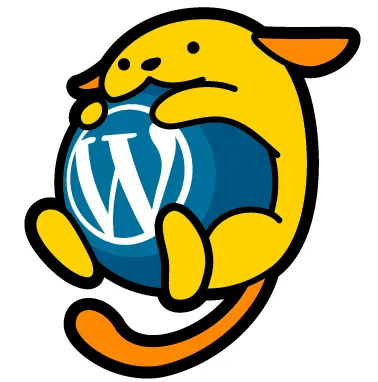
WordPress’s Wapuu is still one of the best examples. On the official Wapuu page, WordPress Japan describes the mascot’s origin, community naming, and derivative usage under a permissive license. That matters because it changes the mascot from a brand-owned illustration into a shared community language.
The strategic lesson is bigger than open source:
- If users can remix the mascot for events, campaigns, stickers, or local communities, it gains cultural depth
- If the brand provides enough rules to protect recognizability while still allowing variation, the mascot becomes more durable
- If every use has to route through a tight approval bottleneck, the mascot often stays shallow
This does not mean every company should fully open-license its mascot. It does mean 2026 brands benefit from thinking in systems and derivatives instead of one pristine master illustration.
Example: Wapuu works because the community can extend it
Wapuu has remained relevant because the core character is stable while local variations keep it alive.
Source: WordPress Japan Wapuu page.
6. Motion-Ready Mascots Are Replacing Print-First Mascots
Mascots used to be designed mostly for static marketing assets. That is not enough anymore.
Adobe’s 2026 trend forecast puts heavy emphasis on emotional immersion, playful interaction, and multisensory brand moments. My inference for mascot systems is that characters now need to survive in motion:
- Short looping reactions
- App micro-moments
- Social stickers and reaction GIFs
- Lightweight product animations
- Creator collaborations and short-form video
This is one reason flat, overly detailed mascots often underperform. They may look fine in a single hero image but collapse when you try to animate them quickly, crop them tightly, or adapt them to platform-native formats.
Duolingo shows what a motion-first character system looks like inside a real app. Its design team gave each character a unique animation that plays after a correct answer, then added mid-lesson animations to reward a run of correct answers. A later engineering write-up describes using Rive state machines to combine poses, idle behavior, lip-sync mouth shapes, and reactions across Android, iOS, and the web.
Example: Duolingo’s characters react inside the lesson
This official Duolingo animation shows Duo and Lily moving through a mid-lesson reward. The important detail is not just that the characters move: the animation is tied to learner progress and lives inside the product experience.

Source and animation: Duolingo, “Building character”. Technical details: How Duolingo animates its characters.
The modern test is simple: if your mascot cannot work as a still, a sticker, a tiny UI accent, and a short animated beat, it is not really a 2026-ready brand asset.
What Brands Are Still Getting Wrong
A lot of mascot content still misses the same four problems:
Chasing style before distinctiveness
If the silhouette is weak and the face is forgettable, adding a trendy rendering style will not fix the problem.
Building one hero pose and calling it a system
You do not have a mascot program until the character works across product states, campaigns, and routine content production.
Over-specifying every detail
Mascots need rules, but they also need room to move. Overly rigid characters often become expensive to use and hard to adapt.
Treating the mascot as decoration
Mascots work best when they support a real job: onboarding, reassurance, explanation, celebration, memory, or community signaling.
How to Apply These Trends to Your Own Mascot
If you are building or refreshing a mascot in 2026, start here:
- Audit distinctiveness first. Remove the logo and ask whether the character is still recognizable from shape, face, and color alone.
- Define the mascot’s role. Decide whether it primarily guides, celebrates, teaches, reassures, or entertains.
- Build an expression library. Start with at least six to ten core emotional states instead of one default smile.
- Set style constraints. Lock the silhouette, proportions, eye treatment, color logic, and line behavior before generating lots of variations.
- Design for motion early. Test the mascot in a small loop, sticker crop, and tiny UI use case before calling the system complete.
- Create a variation policy. Be explicit about what can change and what must stay constant when teammates, agencies, or communities create new poses.
FAQ
What are the biggest brand mascot design trends for 2026?
The biggest trends are distinctive silhouettes, reusable expression systems, human-made texture, motion-ready assets, supportive character behavior, and controlled community remixing. The common thread is system design: the mascot needs to work across product, marketing, social, and support moments.
Are character design trends and mascot design trends the same thing?
They overlap, but they are not the same. Character design trends often focus on visual style. Mascot design trends also have to cover brand recognition, emotional behavior, usage rules, motion, and repeatable production.
Are mascots still effective for B2B brands in 2026?
Yes, but only when they make the product feel clearer, warmer, or more memorable. A mascot that is merely decorative usually underperforms. A mascot that explains, reassures, or creates a distinctive memory structure can work very well in B2B.
What makes a mascot memorable?
The best evidence points to distinctiveness first: recognizable shape, stable features, and repeated use over time. Style matters, but recognizability matters more.
Should your mascot be an animal, a person, or an abstract character?
There is no universal winner. The better question is which form gives you the clearest personality without introducing the wrong baggage. Animal and abstract mascots are often easier to keep broad and portable. Human mascots can work well when relatability is central.
How many mascot expressions do you really need?
For most product and marketing teams, six to ten core states is a good starting point: welcome, thinking, celebrating, helping, concerned, and delighted. Expand from there based on real use cases, not hypothetical ones.
How should app and SaaS teams apply mascot marketing trends?
Start with a few high-leverage product moments instead of a large campaign: onboarding, empty states, success screens, feature launches, and lifecycle emails. A focused app mascot strategy usually beats a broad character system that nobody knows where to use.
Sources
- Adobe: Creative Trends 2026
- Ipsos: Why Nostalgia Is So Fetch: What Brand Mascots Say About Consumers Today
- Ipsos: Be Distinctive Everywhere
- Mailchimp Brand Assets
- Mailchimp Content Style Guide: Voice and Tone
- Duolingo: Reshaping Duo
- Duolingo: Super Duo
- Duolingo: Building character
- Duolingo: How its characters lip-sync
- Asana: Celebrations revamped
- Asana Help: Display settings
- WordPress Japan: Wapuu
- Journal of Consumer Research: Brands as Rivals
- Computers in Human Behavior: Seeing brands as humans
- Journal of Fashion Marketing and Management: When brands are built for humans
What This Means for Your Brand
The brands winning with mascots in 2026 are not the ones following a single aesthetic trend. They are the ones building distinctive characters with emotional range, clear rules, and enough flexibility to live across product, marketing, and community surfaces.
If you take one thing from the research, make it this: the right mascot is not a decorative extra. It is a distinctive brand asset with a job to do.
Ready to turn these trends into a mascot system you can actually use?
Ready to build a mascot that stays recognizable everywhere?
Create a mascot system with clear visual rules, emotional range, and pose libraries you can reuse across product and marketing.
Create Your Mascot