May 31, 2026
Reference Image AI: How to Turn One Image Into a Reusable Style Guide
Learn how to use a reference image for AI illustration workflows without copying the subject, drifting styles, or losing brand consistency.

A reference image is one of the fastest ways to guide AI illustration. It gives the model visual information that text alone struggles to describe: line rhythm, color temperature, density, texture, composition, and mood.
But a reference image can also create problems. The model may copy the subject too closely. The style may drift. The result may look good once and fail when you change the prompt.
The goal is not to copy an image. The goal is to extract a reusable style system from it.
Reference Image vs Style Reference
A reference image can influence two things:
- Subject — what appears in the image
- Style — how the image is made
Most failed reference workflows happen because those two are mixed together. You upload a painting of a wave, ask for a robot, and get a robot that still looks suspiciously like a wave scene.
A style reference workflow separates the subject from the visual language.
Example: A Reference With Strong Style Signals
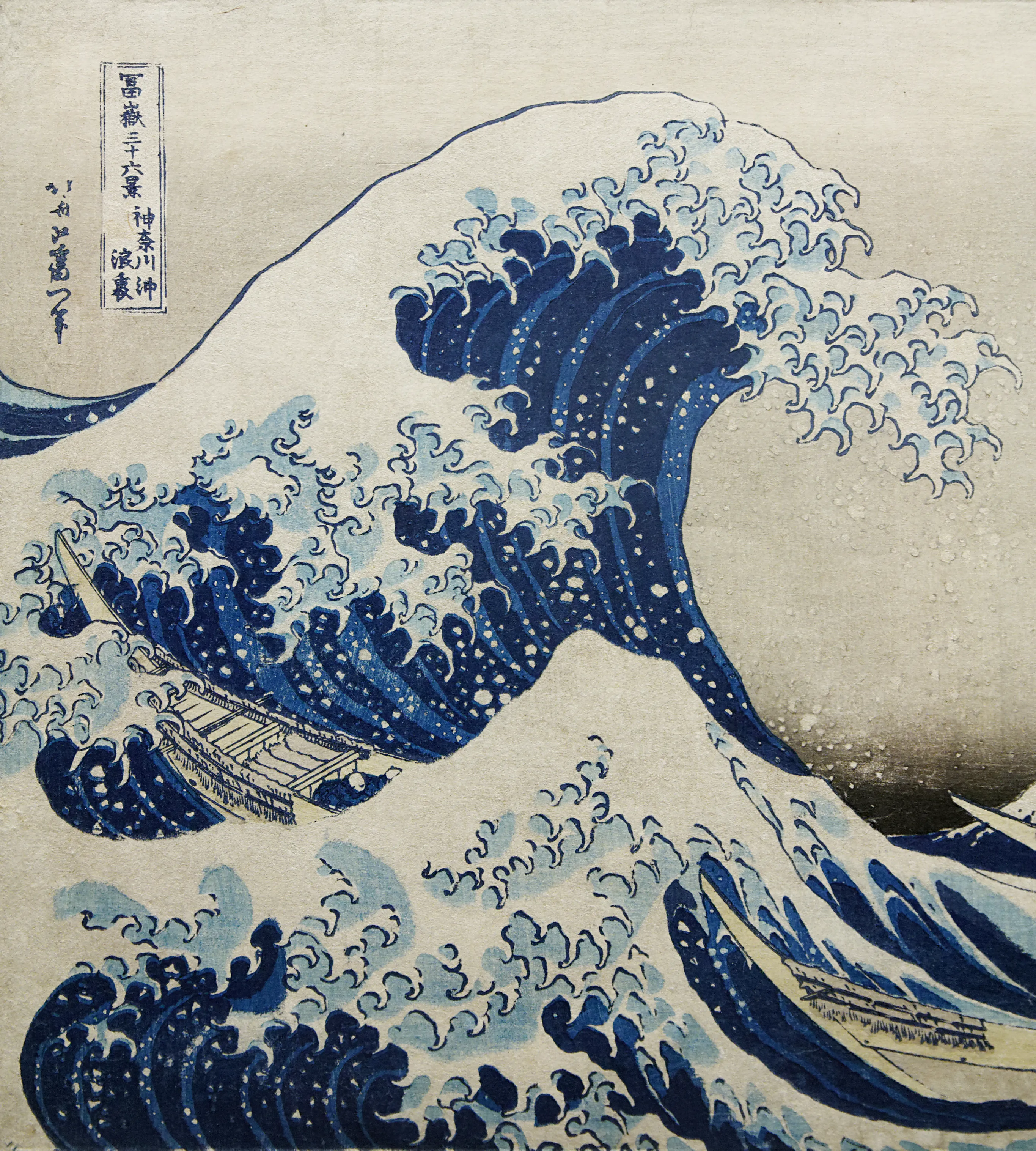
Source: The Great Wave off Kanagawa, Katsushika Hokusai, public domain.
This image has extremely clear style signals: bold contour lines, limited palette, flat color areas, patterned water shapes, strong diagonal movement, and high contrast between foreground wave and background mountain.
If you used it as a reference, you would not write “make the same wave.” You would extract the style language.
The Six-Part Style Extraction Method
1. Line Quality
Describe the lines before the subject.
Ask:
- Are the lines thick or thin?
- Are they smooth, rough, broken, or calligraphic?
- Do they outline every shape or only the main forms?
- Is line weight consistent or varied?
Prompt language example:
bold contour lines, crisp hand-cut edges, varied line weight, clear silhouette outlines
2. Color System
Do not say “blue and white” if the palette is more specific. Write the color relationships.
Useful details:
- number of colors
- dominant color family
- accent color
- contrast level
- saturation
- background treatment
For brand work, convert this into palette tokens. A style that cannot be recolored will not survive product use.
3. Shape Language
Look at the geometry.
Are forms rounded, angular, stretched, compact, symmetrical, organic, or modular? Shape language is what keeps a generated set feeling consistent even when the subject changes.
4. Texture and Medium
Texture tells the model what kind of surface to imitate.
Examples:
- flat vector fill
- subtle paper grain
- ink bleed
- risograph noise
- soft airbrush gradients
- screenprint halftone
Be careful with heavy texture if the final output needs clean SVG.
5. Composition
A reference image may have a useful layout pattern: centered object, diagonal movement, large negative space, stacked layers, framed scene, or isolated subject.
If you want reusable brand illustrations, composition is often more important than subject detail.
6. Emotional Tone
Finally, describe mood.
Is it calm, playful, urgent, premium, handmade, technical, nostalgic, or instructional? This helps prevent technically correct but emotionally wrong outputs.
Turn the Reference Into a Reusable Prompt
A good style prompt has slots:
Subject: {subject}
Style: bold contour lines, limited cool palette, flat layered shapes, subtle paper texture, high contrast, strong diagonal composition, handcrafted print feeling
Avoid: photorealism, 3D render, busy background, text, watermark, copied subject from reference
The {subject} slot is important. It reminds you that subject changes while style remains stable.
Test With Unrelated Subjects
Do not test a wave reference by generating more waves. Test it with unrelated subjects:
- a dashboard empty state
- a friendly robot
- a coffee cup
- a product onboarding mascot
- a mountain campsite
If the style survives across unrelated subjects, you have a usable style guide. If it only works on similar images, you have a narrow prompt, not a system.
Turn references into reusable illustration systems
Use style presets, brand palettes, and SVG-ready prompts to keep AI illustrations consistent across assets.
Create a Style PresetHow to Avoid Copying Too Closely
Use reference images ethically and practically:
- Prefer public domain, licensed, owned, or internally created references.
- Extract visual principles, not protected characters or compositions.
- Change the subject, layout, and purpose.
- Use multiple references when possible to avoid cloning one image.
- Keep a source note for every reference.
For commercial brand work, the safest reference is one you own or one from a clearly permissive source.
The Best Reference Images for SVG Work
If the final asset should be SVG, choose references with:
- clear silhouettes
- limited palettes
- simple shading
- separable shapes
- minimal photographic texture
- strong negative space
Avoid references that depend on tiny brush details, complex lighting, or photographic realism. They may look beautiful but translate poorly into scalable vector systems.
The Simple Workflow
- Pick a reference image with clear style signals.
- Write the six-part style breakdown.
- Create a prompt with a
{subject}slot. - Add negatives that prevent subject copying.
- Test five unrelated subjects.
- Save the prompt as a reusable style preset.
- Document what worked and what drifted.
That is how a reference image becomes a repeatable AI style workflow instead of a one-off generation trick.