21 Famous Brand Mascots: Why Their Designs Still Work
A fact-checked tour of 21 famous brand mascots, their real debut dates, and the design lessons behind their staying power.
Quick answer
The most enduring brand mascots do more than decorate a package. They turn a product benefit, a brand name, or a company story into a character people can recognize in a fraction of a second.
- Product-shaped characters make the offer immediately legible.
- Animals create a quick personality shorthand.
- Human figures can embody expertise, strength, or a founder story.
- Entertainment characters grow through stories and repeated behavior.
This list examines 21 enduring brand characters through their visual design, brand role, and documented history. Where a character evolved in stages, each entry distinguishes the first appearance from the version audiences know today.
Dates that need context
Mascot histories often involve several valid dates: a brand launch, a character debut, and a later redesign. These are the most important distinctions:
| Mascot | First introduced / key milestone | Why the distinction matters |
|---|---|---|
| Mr. Peanut | Created in 1916 by 13-year-old Antonio Gentile | Planters identifies Gentile as 13 when he submitted the original sketch. |
| Jolly Green Giant | First appeared in 1925 | The familiar friendlier look evolved later; 1928 is not the first appearance. |
| Tony the Tiger | Introduced in 1952 | Kellogg’s company timeline does not support 1951. |
| Cornelius Rooster | Introduced in 1958 | Kellogg’s current corporate timeline uses 1958. |
| Captain Morgan | Don Maitz developed the painted character in 1982 | The artist’s own account predates the often-repeated 1983 date. |
| M&M’S characters | Talking candy characters appeared in 1954; the modern CGI cast arrived in the mid-1990s | “Debut” depends on which version is being discussed. |
| Colonel Sanders | Fronted the growing franchise in the 1950s | 1998 was a logo era, not the character’s birth. |
| GEICO Gecko | Advertising debut in 1999 | GEICO’s corporate timeline corrects the commonly listed 2000 date. |
Product made visible
These mascots work because the character is made from the product, its ingredients, or the physical problem it solves.
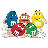
1. The M&M’S spokescandies
First introduced: character advertising in 1954; modern ensemble in the mid-1990s.
The M&M’S cast is an unusually literal system: every character is the product, yet color, facial expression, and voice create distinct personalities. That gives the brand a flexible ensemble without weakening recognition. Red can be skeptical, Yellow can be guileless, and Orange can be anxious while every frame still advertises the candy.
The familiar personality-led campaign took shape in the mid-1990s, but anthropomorphic candies appeared much earlier. Contemporary histories describe talking M&M’S characters in 1954 advertising, while the official M&M’S history confirms the period’s major product milestones.

2. Kool-Aid Man
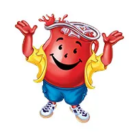
First introduced: smiling pitcher concept in 1954.
Kool-Aid Man makes the package promise impossible to miss: he is a pitcher filled with the drink. The transparent glass body, bright red liquid, and oversized smile make the character readable even before a viewer sees the wordmark. His wall-breaking entrance later added a repeatable action and catchphrase, transforming a package symbol into a performer.
Kraft Heinz says the character first appeared in advertising in 1954, when the design was known as the Pitcher Man. The name and more boisterous persona came later. That evolution is a useful lesson: a strong visual premise can precede the fully developed personality. See the Kraft Heinz character history.

3. The Pillsbury Doughboy
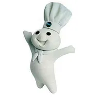
First introduced: November 7, 1965.
Poppin’ Fresh looks as though he has been shaped from the dough he promotes. Soft white forms communicate texture; the chef’s hat and neckerchief establish kitchen competence; and the famous belly-poke reaction adds an interaction audiences can anticipate.
The character also demonstrates the value of designing for a medium. Rudy Perz conceived the Doughboy popping from a refrigerated dough can, and the first commercials used stop-motion animation. His proportions and gestures were built for short, repeatable television moments. General Mills’ 60th-anniversary history confirms the 1965 debut.

4. Mr. Peanut
First introduced: created in 1916; national print debut followed in 1918.
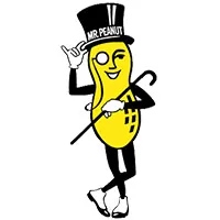
Mr. Peanut turns an ordinary ingredient into a tiny aristocrat. His top hat, cane, gloves, and monocle produce a sharp contrast with the rough peanut shell, making the silhouette easy to recall and giving a commodity product an air of ceremony.
Planters confirms that 13-year-old Antonio Gentile submitted the winning character idea in 1916. A commercial artist refined the sketch into the formal figure recognized today. The age correction matters because the unlikely origin is part of the mascot’s cultural history, documented by both Planters and the Smithsonian’s National Museum of American History.

5. Michelin Man
First introduced: 1898.
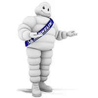
Bibendum is assembled from the product category itself: stacked tires become a head, torso, and limbs. The construction creates a memorable modular silhouette that can be redrawn, modeled, or animated without losing the core idea.
The character’s white color can surprise modern viewers, but early tires were pale before carbon black became common in production. Michelin traces the idea to a pile of tires noticed by brothers Édouard and André Michelin in 1894; artist O’Galop turned it into an advertisement four years later. Michelin’s own account covers the birth of the Michelin Man.

Animals as personality shorthand
Animal mascots borrow qualities audiences already understand: speed, confidence, playfulness, morning energy, or calm reassurance.
6. GEICO Gecko
First introduced: 1999.
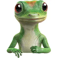
The gecko began with wordplay: “GEICO” and “gecko” sound close enough to turn a frequently misheard company name into a visual mnemonic. The small animal also helps an insurance company speak in a less institutional voice. Rather than illustrating policies or cars, the mascot makes the brand name itself easier to remember.
GEICO’s corporate timeline places the advertising debut in 1999, not 2000. The distinction is small, but it shows why company timelines are preferable to repeated listicle dates. See GEICO’s official history.

7. Chester Cheetah
First introduced: 1986.
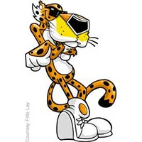
Chester’s species does two jobs at once. “Cheetah” echoes Cheetos, while the animal’s speed and sleek movement support a confident, restless personality. Sunglasses, sneakers, and an elongated pose make him feel less like a zoological illustration and more like a pop-culture character.
The brand has changed Chester’s tone over the decades, but the name-species connection and spotted orange silhouette remain stable. PepsiCo’s Cheetos history says Chester has represented the brand since 1986.

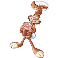
8. Quicky, the Nesquik Bunny
First introduced: in a U.S. commercial in 1973.
A rabbit is an efficient visual metaphor for quick preparation and high energy. Quicky’s long ears make him identifiable in silhouette, while the branded collar and sporty styling give the character a portable set of visual anchors.
The mascot’s rollout varied by country, and some markets kept other characters for years. Nestlé’s Portuguese history identifies Quicky’s first U.S. appearance in 1973, while other Nestlé market histories describe later local adoption. That regional variation is why a single global “debut” can be misleading.

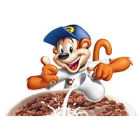
9. Coco the Monkey
First introduced: during the 1960s, with timing varying by market.
Coco’s value lies less in a precise origin year than in his fit with the brand’s playful tone. A monkey suggests movement, mischief, and appetite; a cap and expressive tail create more opportunities for physical comedy. The character can act out a miniature adventure while keeping the cereal bowl in view.
Coco Pops has used different names and mascots across countries, so the 1963 date often quoted online should not be treated as a universal launch. Kellogg’s current Coco character page shows how the company now defines him: clever, cheeky, and entertainment-led.

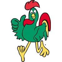
10. Cornelius Rooster
First introduced: 1958 on Kellogg’s current corporate timeline.
Cornelius is an example of semantic fit. A rooster announces morning, and breakfast cereal belongs to the same moment of the day. The design therefore communicates use occasion without showing a clock, sunrise, or breakfast table. His red comb, green body, and yellow beak also make the character easy to separate from the mostly white cereal box.
Older sources sometimes cite 1957, while Kellogg’s historical materials broadly say “late 1950s.” The current WK Kellogg timeline gives a specific 1958 introduction, which this article uses.

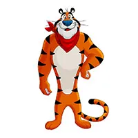
11. Tony the Tiger
First introduced: 1952.
Tony gives Frosted Flakes an energetic coach rather than a passive package symbol. His broad shoulders, direct gaze, and open gestures project confidence, while the orange-and-black palette naturally connects him with the cereal’s warm package colors.
He also illustrates how a stable role can outlast stylistic change. Tony’s proportions have become more athletic over time, but he still performs the same job: encouraging the audience and endorsing the product with contagious enthusiasm. WK Kellogg’s timeline confirms that Tony debuted with Sugar Frosted Flakes in 1952.

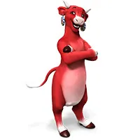
12. The Laughing Cow
First introduced: 1921; the earring design followed in 1924.
The Laughing Cow anchors the brand in one unmistakable emotion. Her red head, earrings, and wide smile create a friendly face that remains legible on small foil wedges. The earrings also contain miniature packages, an early example of a playful recursive brand image.
The design did not arrive fully formed. The brand began in France in 1921 using a cow derived from Benjamin Rabier’s earlier illustration, and founder Léon Bel introduced the earring version in 1924. The official Laughing Cow timeline makes that evolution clearer than a single debut date can.

Human figures and brand roles
These characters make an abstract promise—strength, authority, wealth, adventure, or expertise—feel like a person audiences can recognize.
13. Mr. Muscle
First introduced: in the United Kingdom in 1986.
Mr. Muscle turns cleaning strength into a superhero metaphor. The exaggerated physique, bold stance, and work-ready costume promise that difficult household jobs can be handled with less effort. It is not subtle, but it is immediate.
The original product was an oven cleaner, a category where “strength” is a useful organizing idea. The character lets that idea travel to other surfaces and products without requiring a new visual concept each time. The brand’s UK site confirms that Mr. Muscle originated in 1986.

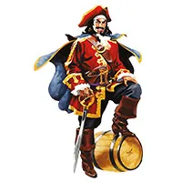
14. Captain Morgan
First introduced: the familiar painted character was developed in 1982.
Captain Morgan packages the brand as a story world: red coat, boots, sword, shipboard posture, and one raised leg suggest swagger and seafaring adventure. The pose is especially important because it can be imitated by people, giving the brand a participatory gesture in addition to a label illustration.
Illustrator Don Maitz says he developed the character for Joseph E. Seagram & Sons in 1982. The historical Sir Henry Morgan inspired the name, but the label figure is a designed brand persona rather than a documentary portrait.

15. Mr. P from Pringles
First introduced: 1967.
The Pringles face is built for a package that already breaks category conventions. His oval head, sweeping mustache, and bow tie compress into a compact mark that fits the cylindrical can and remains readable at small sizes.
The character is generally known as Mr. P or Julius Pringles. The first name spread online long after the mascot was created, while the documented design date is much clearer: Kellogg’s brand material credits Arch Drummond with creating Mr. P in New York in 1967.

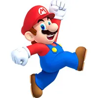
16. Mario
First introduced: 1981 as Jumpman in the Donkey Kong arcade game.
Mario was designed under severe technical constraints, and those limitations strengthened his identity. A mustache separated nose from mouth, a cap avoided the need to animate hair, overalls clarified arm movement, and high-contrast colors made a tiny sprite readable.
Unlike most characters here, Mario became a brand representative by starring in the product itself. The audience knows him through actions—jumping, running, rescuing, exploring—not just through endorsements. Nintendo confirms that Shigeru Miyamoto created the character and that he was called Jumpman in 1981’s Donkey Kong.

17. Mr. Monopoly
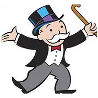
First introduced: on U.S. Monopoly cards in 1936; the Rich Uncle Pennybags name followed later.
Mr. Monopoly visualizes the fantasy at the center of the game: accumulated property and wealth. Tuxedo, top hat, cane, and confident gestures create an instantly readable caricature of a prosperous tycoon. His rounded drawing style keeps that theme playful rather than intimidating.
The character is also a reminder that names can lag behind images. He appeared before he was formally called Rich Uncle Pennybags and was later standardized as Mr. Monopoly. The visual role—personifying the game’s economy—was clear before the naming system settled.

18. Jolly Green Giant
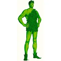
First introduced: 1925; the company changed its name to Green Giant in 1950.
The Giant began as a way to dramatize the size of a new pea variety. Early versions were stern and bore little resemblance to the relaxed, leafy figure audiences know today. Making him greener, friendlier, and eventually “Jolly” aligned the character with vegetables, abundance, and a welcoming family brand.
This is one of the clearest factual corrections in the list. Green Giant’s own history says the character first appeared in 1925, not 1928, and became the company’s iconic symbol by the time the business adopted the Green Giant name in 1950.

19. Mr. Clean
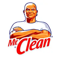
First introduced: as a product and television character in 1958.
Mr. Clean combines two familiar visual codes: the bald, muscular strongman and the immaculate white uniform. Together they promise power without mess. A single hoop earring and crossed-arm pose prevent the figure from becoming a generic cleaner.
The character shows how a mascot can own a functional benefit. He does not need a complex backstory to explain what the product does; his body and spotless appearance carry the claim. Today’s official Mr. Clean character page continues to frame him around toughness, work, and cleaning expertise.

20. Colonel Sanders
First introduced: as KFC’s brand identity during the franchise’s growth in the 1950s.
Colonel Sanders is different from a wholly invented mascot: he was the founder, spokesperson, and living proof behind the product. White suit, glasses, goatee, and string tie turned his real appearance into a reproducible brand asset. The design works because it signals authorship—this is presented as one person’s recipe and standard.
Sanders wore his iconic white suit from 1950, and the first Kentucky Fried Chicken franchise opened in 1952. By 1998, he was already a long-established brand figure rather than a new mascot. KFC’s official history notes that the Colonel’s face remained central as the logo evolved.

Entertainment icons that became brand symbols
The last character began inside entertainment rather than advertising. That story depth is precisely why the symbol became so powerful.
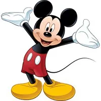
21. Mickey Mouse
First introduced: November 18, 1928.
Mickey’s three-circle head construction, white gloves, red shorts, and large shoes create a design that can survive enormous changes in rendering style. More importantly, audiences learned his personality through stories. The company symbol inherited decades of optimism, mischief, and familiarity from the character’s screen life.
Disney recognizes the New York release of Steamboat Willie on November 18, 1928 as Mickey’s public debut, even though two silent shorts had been produced earlier. The distinction is documented in the D23 history of the film.

What these mascots have in common
The visual styles span more than a century, but the underlying design rules are remarkably consistent:
- One strong recognition cue. Michelin has stacked tires, Mickey has circular ears, Pringles has a mustache, and the Laughing Cow has red earrings.
- A role, not just a look. Tony coaches, the Doughboy reacts, Chester performs cool confidence, and the Gecko explains.
- A link to the offer. The best characters connect to a product shape, name, use occasion, ingredient, benefit, or founder story.
- Room to evolve. Successful mascots change rendering style while preserving silhouette, palette, behavior, and signature props.
- Repetition across moments. Packaging may introduce the character, but stories, ads, product experiences, and social content build familiarity.
The practical lesson is not to copy a tiger, gecko, or mustachioed gentleman. It is to find the shortest visual route between your brand’s promise and a character people can recognize—and then give that character enough behavioral consistency to grow.
Editorial note: Images are reproduced for identification, criticism, and design commentary. All trademarks and character rights belong to their respective owners.
Build a mascot people can recognize in every pose
Turn one character direction into a consistent SVG mascot system for your product, website, and campaigns.
Create Your Mascot