48 Famous App Mascots and Product Characters (2026)
A researched library of 48 famous and fast-growing app mascots, with images, sources, and product-design lessons.
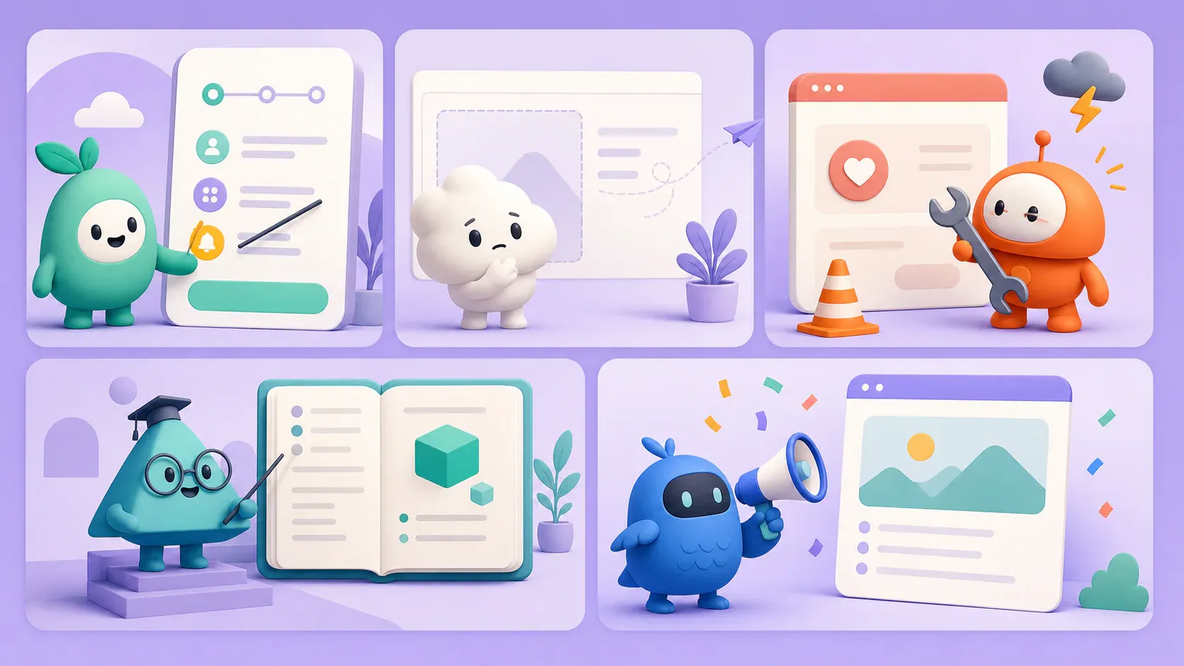
Quick answer
This 2026 library includes established product characters such as Duolingo’s Duo, Discord’s Wumpus, Reddit’s Snoo, DuckDuckGo’s Dax, Hotels.com’s Bellboy, Hopper’s bunny, Finch’s birb, Tripadvisor’s Ollie, Microsoft Copilot’s Mico, and Widgetable’s pet cast.
This library puts special weight on characters that broke out or changed meaning in 2025–2026: Bellboy, Mico, Firefox’s Kit, Focus Friend’s bean, Wego’s Weegio, Poparide’s Popabear, Proton’s Lumo, Musa’s Mussy, Stoat’s Toast, and Dax’s expanding Easter-egg system.
Prefer to explore by product type? Open the filterable app mascot database to browse all 48 profiles by category and read the complete case studies.
48 app mascots and product characters

Android: The Bot
Google refreshed the Android robot as The Bot, a more dimensional and customizable platform character that can move across devices and campaigns.
Why it works: A platform mascot needs enough visual flexibility to represent an ecosystem rather than one narrow feature.

Asana: Celebration Creatures
Asana's Celebration Creatures occasionally streak across the product after tasks are completed, including the famous flying narwhal.
Why it works: Sporadic rewards stay delightful longer than constant animation, especially when they follow real accomplishment.

Boo: Winking ghost
Boo's winking ghost gives its personality-based dating app a friendly, low-pressure identity that survives from icon to social creative.
Why it works: A compact facial expression can communicate the whole brand tone before the user sees a screen.

Bun: The Bun
Bun's smiling bun turns a performance-focused JavaScript runtime into a character developers can recognize instantly in docs, releases, and community posts.
Why it works: A literal name-to-character idea can make technical infrastructure memorable before the audience reads a benchmark.

CodeRabbit: Rabbit mark
CodeRabbit's rabbit head gives an AI code-review service a fast, recognizable identity across GitHub, launch creative, and developer content.
Why it works: A logo-mascot hybrid is often enough for a young product; build poses only when the character has a real communication job.

Datadog: Bits
Datadog's Bits translates abstract infrastructure concepts into a small, flexible character used in illustration and brand communication.
Why it works: Technical products benefit when a mascot can personify invisible systems without oversimplifying the actual interface.


Deno: Deno the dinosaur
Deno's dinosaur pairs a serious JavaScript runtime with a soft, hand-drawn identity used throughout launches, docs, and community communication.
Why it works: A low-detail character can make developer infrastructure memorable without making the product feel childish.

DigitalOcean: Sammy the Shark
Sammy gives DigitalOcean's tutorials and developer community a welcoming guide that is more approachable than cloud-infrastructure diagrams.
Why it works: Documentation mascots work when they help a broad content library feel coherent without interrupting the teaching.

Discord: Wumpus
Wumpus turns Discord's playful brand voice into a flexible character used across product states, seasonal art, community campaigns, and merchandise.
Why it works: A mascot becomes a system when it has enough poses, props, and situations to follow the product everywhere.

Docker: Moby Dock
Docker's container-carrying whale, named Moby Dock, turns the product's core abstraction into one literal and memorable image.
Why it works: The most efficient mascot concepts explain the product metaphor and the company identity at the same time.

DuckDuckGo: Dax Brown
Dax gives DuckDuckGo's privacy tools a friendly, recognizable face. The duck now appears in more than 600 search Easter eggs as well as the browser's core identity.
Why it works: A simple base character becomes a content engine when it can absorb hundreds of topical costumes without losing recognition.

Duolingo: Duo
Duo is the benchmark for a mascot that escaped the interface and became a social-media performer. The 2025 'death of Duo' storyline turned a product character into global entertainment.
Why it works: Duo has a clear personality, can react to culture quickly, and still maps back to the app's reminder loop.

Finch: Your birb
Finch makes the mascot the product loop: users care for a personalized 'birb' by completing self-care activities and watching it grow.
Why it works: The character is not decoration or a narrator; it is the emotional reward for doing the app's core behavior.

Firefox: Kit
Mozilla promoted its familiar fox into Kit in 2026: a named character designed to express Firefox's independent, curious personality across social and brand storytelling.
Why it works: A mascot launch feels earned when it reveals the personality users already sensed in the logo.

Focus Friend: Bean
Hank Green's 2025 focus timer makes a tiny bean knit while the user stays away from distracting apps. The character helped the launch climb the App Store charts.
Why it works: Bean visualizes time and creates gentle stakes: breaking focus interrupts a process users want to protect.

Friends: Pengu, Bao and Mellow
The app formerly known as Pengu expanded one shared virtual pet into Friends, a social character world featuring Pengu, Bao, and Mellow.
Why it works: A lovable first mascot can become the wedge for a broader social universe when users already treat it like a relationship.

GitHub: Mona the Octocat
Mona gives GitHub an approachable counterpoint to code-heavy product surfaces and a nearly endless template for events, programs, and community art.
Why it works: A strong base anatomy plus controlled variations can serve hundreds of contexts without fragmenting recognition.

Hootsuite: Owly
Owly translates Hootsuite's social-media expertise into a watchful, adaptable owl that has evolved with the brand rather than being retired.
Why it works: Mascots age better when the design can be simplified and modernized without changing the underlying character idea.

Hopper: The Hopper bunny
Hopper's unnamed rabbit is inseparable from the travel app's icon and pink visual identity, making an otherwise abstract verb instantly tangible.
Why it works: A familiar animal can turn a product name into an image users recognize before they read it.

Hotels.com: Bellboy
Hotels.com checked in Bellboy in 2025 as a hotel-service robot built to front rewards messaging and summer travel campaigns.
Why it works: The strongest launch mascots embody the service promise; Bellboy literally performs hospitality.

Khan Academy Kids: Kodi Bear and friends
Kodi Bear leads a cast built for early learning, where each character can host activities, celebrate progress, and make unfamiliar topics feel safe.
Why it works: For children's products, a cast supports curriculum variety better than forcing one mascot into every teaching role.

LingoDeer: The LingoDeer deer
LingoDeer's deer is more than a name pun: it appears across the learning experience, encourages progress, and gives the app a warmer alternative to classroom imagery.
Why it works: A mascot is strongest when the product name, species, visual identity, and reward loop all reinforce the same memory.

Mailchimp: Freddie
Freddie has survived Mailchimp's evolution from email tool to marketing platform because the chimp remains expressive, recognizable, and tied to the company name.
Why it works: A durable mascot can absorb major visual redesigns when its core silhouette and attitude stay intact.

Microsoft Copilot: Mico
Microsoft introduced Mico as an expressive Copilot companion in late 2025, giving an otherwise invisible AI a face that listens and responds.
Why it works: For conversational products, a restrained character can communicate attention and state without pretending the AI is human.

Microsoft Reflect: The Feelings Monster
The Feelings Monster helps students name emotions inside Microsoft Reflect through a deliberately broad range of expressions and colorful forms.
Why it works: When emotional vocabulary is the product task, character expressions can be functional content rather than decoration.

Mimo: Coding robot
Mimo's small robot gives bite-sized coding lessons a persistent guide and a more playful identity than a generic terminal or graduation cap.
Why it works: A guide character is especially useful when the product asks beginners to repeatedly confront difficult material.

Moz: Roger Mozbot
Moz evolved Roger Mozbot from a recognizable robot drawing into an expressive character system with poses, costumes, and mouth shapes designed for warmer brand communication.
Why it works: The strongest mascot refreshes preserve recognition while adding the expressions and behaviors a growing brand actually needs.

Musa: Mussy
Musa's purple dragon Mussy gives the women's health app a highly visual creator persona. A 2025 UGC case study reported 10 million views and roughly 30,000 monthly downloads.
Why it works: A mascot becomes a social engine when creators can place it in repeatable stories, reactions, and advice formats.

OpenClaw: Molty
OpenClaw's lobster Molty ties the open-source assistant's name, icon, lore, docs, and community culture into one character system.
Why it works: For an emerging developer product, a memorable mascot can create culture and recall before the company has mass awareness.

Poparide: Popabear
Poparide's 2025 brand refresh elevated Popabear as the friendly face of its Canadian carpool marketplace and community-first positioning.
Why it works: For trust-based marketplaces, a mascot can make the brand feel neighborly while real safety mechanisms carry the serious work.

PostHog: The PostHog hedgehog
PostHog has expanded its hedgehog into more than 140 official 'Hoggie' illustrations, giving a fast-moving developer platform a consistent visual language across products and teams.
Why it works: A large pose library works when every variation shares the same anatomy, line style, and slightly grumpy personality.

Proton Lumo: Lumo
Proton launched Lumo in 2025 with a cat-like companion designed to make privacy-focused AI approachable without borrowing the generic sparkle icon.
Why it works: A distinct character can differentiate an AI utility in a category where interfaces and feature lists look increasingly alike.

Pudgy Party: Pudgy Penguin
Pudgy Party brings the established Pudgy Penguins character IP into a mobile multiplayer party game, with customization built around the recognizable penguin body.
Why it works: Licensed characters can supply instant awareness, but the product still needs mechanics that make the character fun to inhabit.

Reddit: Snoo
Snoo is a rare mascot that is both a corporate identity and a community template. Subreddits continually remix the alien without losing the core shape.
Why it works: A deliberately simple base character invites participation and lets a community become part of the brand system.

Salesforce: Astro
Astro anchors Salesforce's wider Trailhead character universe and makes learning enterprise software feel more like a guided journey.
Why it works: A mascot can be most useful outside the core UI, especially when education and community are central to retention.

Snoop: Snoop robot
UK budgeting app Snoop uses a small robot to make transaction analysis and money-saving suggestions feel like proactive assistance rather than bank administration.
Why it works: A mechanical character fits an automated service while friendly proportions stop it from feeling surveillant.

SplashLearn: Splashee
Splashee fronts SplashLearn's game-based learning world and gives children a recognizable guide across math, reading, rewards, and parent-facing creative.
Why it works: A mascot can unify many mini-games when its visual language is stable even as the activities change.

Stoat: Toast
When Revolt rebranded to Stoat, the team introduced Toast as the stoat inside its new logo and app icon while announcing one million registered users in 2026.
Why it works: A mascot reveal can make a necessary rebrand feel like a community event instead of a corporate asset swap.

Tolan: Your Tolan
Tolan makes its AI companion a personalized alien who develops a distinct appearance and memory through conversation.
Why it works: World-building gives an AI relationship boundaries and makes personalization visible rather than merely promised.

Trello: Taco
Taco the husky grew from an office dog into Trello's longtime mascot and a recurring personality in early product communication and social media.
Why it works: Mascots often feel most authentic when they emerge from company culture instead of a naming workshop.

Tripadvisor: Ollie
Ollie extends Tripadvisor's long-running owl identity into a named, approachable travel character rather than leaving it as a pair of logo eyes.
Why it works: Naming and animating an existing brand symbol can unlock stories without discarding accumulated recognition.

Voidpet: Emotion creature cast
Voidpet turns emotions into collectible creatures that users befriend and grow, making internal states visible without reducing the experience to charts.
Why it works: A character system is powerful when every visual variation maps to a meaningful part of the product model.

Waterllama: Hydration llama
Waterllama turns hydration tracking into a parade of expressive animals, led by the llama named in the product itself.
Why it works: A mascot makes repetitive logging feel like collecting progress, while the name gives the character instant recall.

Wego: Weegio
Wego introduced Weegio in 2025 as a friendly travel companion built for cross-market storytelling, content, and physical activations.
Why it works: A globally useful mascot should communicate curiosity and motion before relying on language or local jokes.

Widgetable: Pet cast
Widgetable's pets turn home-screen widgets into shared relationship objects. Users feed, hatch, and care for a cast rather than encountering one static spokesperson.
Why it works: A collectible character system creates more reasons to return, personalize, share, and generate social content.


WordPress: Wapuu
Wapuu is a community-made WordPress mascot whose open remix culture has produced local versions for WordCamps around the world.
Why it works: Permissive community participation can turn one character into a distributed identity system no central team could produce alone.

Wysa: Wysa penguin
Wysa's penguin gives its mental-health chatbot a non-human, non-clinical presence that can guide exercises without resembling a therapist.
Why it works: A gentle animal can lower the emotional stakes of opening a difficult conversation, but clear safety boundaries still matter.

YAZIO: Yettie
YAZIO's fuzzy blue Yettie became a highly shareable counterweight to the clinical visual language common in calorie-tracking apps.
Why it works: A warm character can soften a category associated with guilt, as long as the app's guidance remains responsible.
Turn the pattern into an original mascot
Use the examples for strategy, then create a character with its own silhouette, product job, and pose system in svgapp.
Create an App MascotWhat the fastest-growing mascot apps have in common
The strongest recent examples are not just logos with eyes. Their characters perform one of four jobs:
- They embody the habit. Finch’s birb grows through self-care, Focus Friend’s bean knits while you focus, and Widgetable’s pets need shared care.
- They give AI a bounded persona. Tolan’s alien, Copilot’s Mico, and Proton’s Lumo make an invisible conversation easier to read without pretending to be human.
- They produce repeatable social stories. Duo can star in a daily joke, Mussy can react in UGC, and Weegio can travel through new markets.
- They make a brand change concrete. Bellboy performs hospitality, Dax turns privacy into a recurring actor, and Toast turned a rebrand into a character introduction.
There is also a clear visual pattern: successful mobile mascots use a bold silhouette, a small number of high-contrast colors, readable eyes or a face, and enough structural simplicity to survive at app-icon size. The richer detail appears in campaigns and motion, not in the base mark.
How to use this mascot library
Do not copy the animal or rendering style. Copy the decision behind it.
Use the app mascot database when you want to compare entries within AI, developer tools, education, finance, health, platforms, social, travel, or productivity.
- For a habit app, design a character whose state changes when the user completes the habit.
- For an AI app, define what the character may express and where it must stay neutral.
- For a social-first launch, create a repeatable conflict, reaction, or goal the character can perform every week.
- For a B2B tool, place the mascot in learning, docs, empty states, and release communication before adding it to dense work screens.
- For a character system, lock the shared anatomy and visual grammar before multiplying the cast.
A recognizable mascot is an asset system, not one illustration. Plan the neutral pose, small-size icon, loading state, success moment, error or recovery pose, social reaction set, and motion rules together.
FAQ
Which new app mascots became popular in 2025 and 2026?
The most notable recent launches and breakouts include Focus Friend’s bean, Hotels.com’s Bellboy, Microsoft Copilot’s Mico, Firefox’s Kit, Wego’s Weegio, Poparide’s Popabear, Proton’s Lumo, Musa’s Mussy, Stoat’s Toast, and Android’s renewed character system. Finch, Widgetable, Friends/Pengu, and Tolan also represent the current shift toward mascots that live inside the product loop.
Is an app icon automatically a mascot?
No. A symbol becomes mascot-like when it has a character identity, recognizable behavior, expressions, stories, or a repeatable role. Dax and Boo’s ghost are useful hybrids; a plain geometric logo is not a mascot simply because users recognize it.
The practical takeaway
The recent winners make the same point: a mascot grows when it has a job. It rewards progress, guides a conversation, acts out the product promise, or gives social teams a character capable of endless new situations.
Start with that job. Then build a simple, ownable silhouette and a reusable pose system around it.