
Transparent SVG Mascots: File Formats, Exports, and Clean Product Placement
Understand transparent backgrounds, SVG exports, PNG fallbacks, and how to prepare mascot assets for web and product UI.

Quick Answer
Core idea: Transparent SVG mascots are easier to reuse because they can sit naturally on cards, panels, hero sections, and product screens.
- SVG is ideal for crisp web placement and scalable UI illustration.
- Transparent PNG fallbacks are useful for decks, email tools, and social platforms.
- Always test mascots on dark, light, and brand-colored backgrounds.
Why transparent backgrounds matter
A mascot with a baked-in background is hard to reuse. It may work in a blog header but fail inside a card, onboarding modal, or mobile screen. Transparent assets let the character become part of the interface instead of a poster pasted on top of it.
Transparency also makes asset libraries more flexible. One mascot pose can support a homepage, help article, product empty state, and release graphic with minimal editing.
If you want to learn more about transparent SVG mascot, read Where to Place a Mascot in Your App next. How to Create a Mascot for Your App is also useful when you are mapping the same mascot system across product and marketing.
When to use SVG and when to use PNG
Use SVG when you need crisp scaling, small interface artwork, and clean vector shapes. Use transparent PNG when the destination does not support SVG well or when a raster workflow is easier, such as some email builders, slide tools, or social schedulers.
The important thing is to export intentionally. A mascot should not arrive as a low-resolution screenshot if it will be used across a product.
If you want to learn more about applying this idea in a real product workflow, svgapp vs Lottie: Mascot Generation and Animation Workflows Compared is a practical next step.
Quality checks before shipping
Place the asset on every background it will meet: white, near-black, brand color, muted card, and gradient if your UI uses one. Check edge contrast, shadow behavior, and whether small details disappear. Then test the mobile layout, where mascot assets often become too dominant.
svgapp focuses on production-ready character assets so teams can move faster from concept to placement.
Implementation Checklist
Use this checklist before publishing the mascot assets. It keeps the character useful across the product instead of turning it into a one-page illustration.
- Export transparent SVG for web UI.
- Create transparent PNG fallbacks for non-SVG tools.
- Test on light, dark, and brand-color backgrounds.
- Keep file names descriptive by mascot and pose.
How to Think About Transparent SVG Mascots
This longer-form guide is for teams preparing mascot assets for websites, apps, docs, decks, and social layouts. The goal is to make mascot files easy to place cleanly on many backgrounds and product surfaces. Transparent mascot assets are easier to reuse because they do not force every screen into the same background. SVG also keeps edges crisp and file sizes manageable when the artwork is built cleanly.
The practical question is not whether the mascot is cute. The practical question is whether it helps people understand, remember, or complete something that matters. A strong mascot system should make the next asset easier to create, not harder.
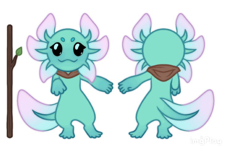
Character sheet reference on Pinterest. The character reference is useful for thinking about clean, reusable shapes that can be exported without a fixed scene.
Build the System Before You Polish the Moment
Separate character from scene
A mascot should exist as a transparent asset before it appears in a hero scene or campaign layout. That separation lets product designers place the same character on cards, panels, empty states, and docs.
Test backgrounds early
Place the mascot on white, dark, tinted, gradient-free, and image backgrounds. Watch for lost outlines, low-contrast details, awkward shadows, and crops that cut off important gestures.
Keep SVG details practical
SVG is best when the shape language is clean. Excessive texture, tiny gradients, and complex filters can make exports heavier and harder to recolor or animate later.
What to Notice in the Pinterest Reference
Use Pinterest as a research board, not as a source to copy. The goal is to notice the design decisions that make a character usable across contexts, then translate those decisions into your own brand system.
- Look for a character that reads without a fixed background.
- Notice which details would survive transparent export.
- Ask whether the pose could sit naturally inside a UI card.
Common Mistakes to Avoid
- Exporting only flattened hero images.
- Using shadows or glows that depend on one background color.
- Forgetting small-size and dark-mode tests.
Production Checklist
- Export transparent SVG and PNG variants.
- Test light, dark, and tinted backgrounds.
- Keep detail density appropriate for UI size.
- Store source files and usage examples together.
How to Measure Whether It Worked
Treat the mascot like a product asset. Once it ships, review whether it improves clarity, recognition, speed, or reuse. The most useful metrics for this article are:
- Number of surfaces where the mascot can be reused
- File size and render quality
- Manual cleanup required after export
- Consistency across light and dark themes
Generate transparent mascot assets for your app
Create SVG mascots with clean backgrounds, consistent styling, and poses ready for real product placement.
Create Your Mascot