
Mascot vs Logo: When Your App Needs a Character Instead of Another Mark
A practical comparison of logos, mascots, icons, and brand characters for software teams.

Quick Answer
Core idea: A logo identifies the product; a mascot helps the product communicate. Most teams need both, but they should do different jobs.
- A logo should be compact, stable, and legally ownable.
- A mascot should be expressive, situational, and useful in product communication.
- Use the mascot where tone matters and the logo where recognition must be instant.
The logo is the signature
A logo is a mark of identity. It belongs in the nav, app icon, invoice, legal footer, and every place where the user needs to know who is speaking. Because it must work at tiny sizes and across every context, a logo usually has limited emotional range.
That constraint is a strength. You do not want your core mark changing every time the product celebrates, apologizes, or explains something complicated.
If you want to learn more about mascot vs logo, read Brand Mascot Guide: How to Design a Character People Actually Associate With Your Product next. Best Brand Mascots: What Software Teams Can Learn From Memorable Characters is also useful when you are mapping the same mascot system across product and marketing.
The mascot is the voice with a face
A mascot can wave hello, hold a checklist, investigate a bug, cheer for a completed task, or gently point users toward the next step. It can communicate tone without adding paragraphs of copy. That makes it especially valuable in product surfaces where users are impatient or uncertain.
The mascot should not replace the logo. It should extend the brand into moments where a static mark would feel too cold or too vague.
If you want to learn more about applying this idea in a real product workflow, How to Create a Mascot for Your App is a practical next step.
How to decide what you need now
If your product is hard to distinguish in a crowded category, a mascot can help create memory. If your onboarding needs warmth, a mascot can make the first session feel less mechanical. If your brand already has strong recognition but your product moments feel dry, a character can add emotional texture without touching the logo.
Start small. Keep the logo stable, then create a mascot kit for the highest-impact touchpoints. That gives you signal before you redesign the entire brand around a character.
Implementation Checklist
Use this checklist before publishing the mascot assets. It keeps the character useful across the product instead of turning it into a one-page illustration.
- Use the logo for identity, navigation, and legal surfaces.
- Use the mascot for onboarding, education, celebration, and recovery.
- Do not force the mascot into the app icon unless it remains readable.
- Document how the mascot and logo appear together.
How to Think About Mascot Versus Logo Decisions
This longer-form guide is for founders choosing whether their visual identity needs a character, a logo, or both. The goal is to understand when a mascot adds strategic value beyond a mark. A logo identifies the brand. A mascot can represent the brand’s behavior. The decision is not either-or; many teams use a simple logo for recognition and a mascot for communication.
The practical question is not whether the mascot is cute. The practical question is whether it helps people understand, remember, or complete something that matters. A strong mascot system should make the next asset easier to create, not harder.
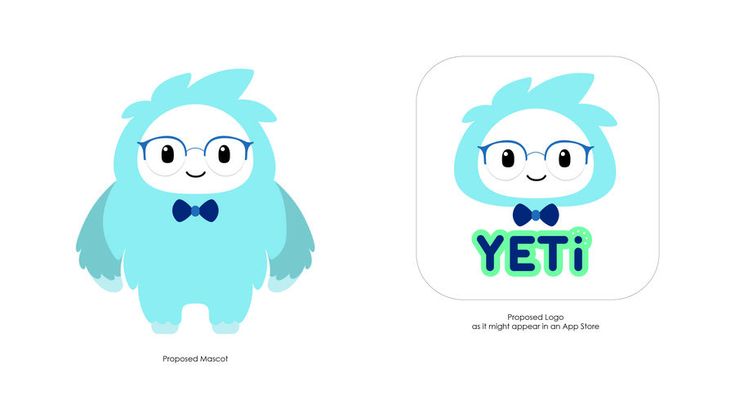
Design App Mascot and Logo on Pinterest. The mascot-and-app-icon reference is useful because it shows how a character and logo system can relate without being identical.
Build the System Before You Polish the Moment
Use a logo for formal identity
A logo needs to work on invoices, app icons, nav bars, favicons, decks, and legal pages. It should be stable, simple, and recognizable at tiny sizes.
Use a mascot for communication
A mascot can welcome users, recover from errors, celebrate progress, explain abstract value, and make social posts feel owned. It is more expressive than a logo and more situational.
Build a relationship between them
The mascot does not need to become the logo. It can share colors, shapes, or a face detail. The logo can stay clean while the mascot carries emotion in product and marketing moments.
What to Notice in the Pinterest Reference
Use Pinterest as a research board, not as a source to copy. The goal is to notice the design decisions that make a character usable across contexts, then translate those decisions into your own brand system.
- Look at how the character and icon can share identity cues.
- Notice which elements are simple enough for app-icon scale.
- Ask whether the mascot would still work without the wordmark.
Common Mistakes to Avoid
- Forcing a detailed mascot into a tiny logo slot.
- Assuming a logo alone can handle onboarding and error communication.
- Letting the mascot style conflict with the formal mark.
Production Checklist
- Define which assets are logo-only and mascot-friendly.
- Test app icon, header, social avatar, and hero placements separately.
- Keep shared colors or shapes between the systems.
- Document when to use the mascot instead of the mark.
How to Measure Whether It Worked
Treat the mascot like a product asset. Once it ships, review whether it improves clarity, recognition, speed, or reuse. The most useful metrics for this article are:
- Recognition at icon size
- User comprehension on mascot-supported messages
- Consistency across brand touchpoints
- Internal clarity about asset usage
Add a character without redesigning your whole brand
Use svgapp to create a mascot that works alongside your current logo, palette, and product UI.
Create Your Mascot