Where to Place a Mascot in Your App
A practical map of the product screens where mascots help most: onboarding, empty states, loading, errors, success, and upgrade paths.
Quick Answer
This guide is for product designers adding mascots without cluttering the interface. The search intent behind app mascot placement is usually practical: teams want to know what to make, where to use it, and how to keep the mascot consistent once it leaves the first hero section.
Core idea: Mascots belong in moments where users need orientation, reassurance, celebration, or recovery.
- Do not place mascots everywhere. Use them where emotion or explanation is useful.
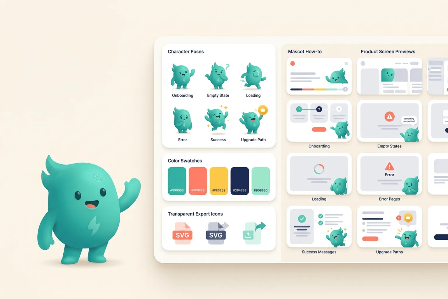
- The best first placements are onboarding, empty states, errors, and success screens.
- Each placement should use a pose that matches the user’s state of mind.
Onboarding and first-run screens
A mascot can make first-run onboarding feel less like paperwork. Use a welcoming pose, a pointing pose, or a checklist pose to guide users through setup. Keep the copy short and let the character carry warmth, not instruction overload.
The mascot should never hide the primary action. Place it near the supporting text or illustration area so the button and form remain obvious.
If you want to learn more about app mascot placement, read App Onboarding Mascot Examples and Patterns next. Where to Place a Mascot in Your App is also useful when you are mapping the same mascot system across product and marketing.
Empty states and waiting moments
Empty states are perfect mascot territory because they combine explanation and emotion. A blank dashboard can feel like failure; a calm mascot with a clear next step can make it feel like the beginning. Loading and processing states can also use light character moments if they do not slow the user down.
Use the pose to describe what happens next: searching, building, importing, waiting, or celebrating progress.
If you want to learn more about applying this idea in a real product workflow, Mascots for SaaS: Product Moments That Benefit From a Character is a practical next step.
Errors, success, and upgrades
Error screens need empathy, not clown energy. Choose a mascot pose that acknowledges the issue and points toward the fix. Success screens can be more expressive, especially after a user completes a meaningful task. Upgrade screens should feel helpful and aspirational rather than manipulative.
Across all placements, the mascot should make the product feel clearer. If it adds visual weight without improving comprehension, remove it.
Implementation Checklist
Use this checklist before publishing the mascot assets. It keeps the character useful across the product instead of turning it into a one-page illustration.
- Map product moments by user emotion.
- Pick one mascot pose per moment.
- Keep primary actions visually dominant.
- Review screens on mobile so the mascot does not crowd the UI.
Copy This Prompt
Use this as a starting point in svgapp, then add your brand colors, product category, audience, and any reference image that should guide the character.
Generate a set of SVG mascot poses for app UI placement: onboarding welcome, empty dashboard, loading work-in-progress, friendly error, and success celebration.Create mascot poses for the screens that need them
svgapp helps you generate production-ready mascot assets for onboarding, empty states, errors, and success moments.
Create Your Mascot