10 Things to Consider When Creating Your First App Mascot
Design a memorable, useful first app mascot with ten practical checks for strategy, personality, accessibility, poses, files, and brand consistency.
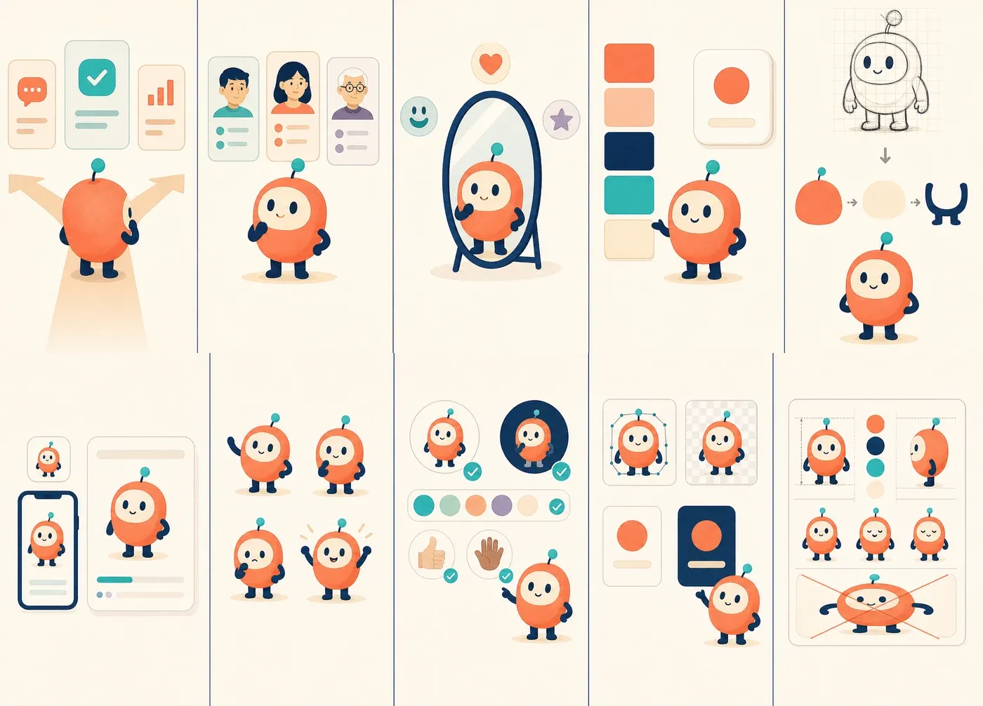
An app mascot can make an unfamiliar product feel welcoming, turn an empty state into a useful moment, and give your brand a face people remember. It can also become expensive decoration if it is designed without a role, a production plan, or rules for consistent use.
That is the real challenge with a first mascot. You are not designing one charming illustration. You are designing a character that must remain recognizable across onboarding, notifications, error messages, social posts, tiny icons, and future poses that do not exist yet.
This guide covers the ten decisions worth making before you approve the first character. Each point includes a visual example built around the same fictional app mascot, so you can see how one character becomes a practical product system.
The 10-point checklist
If you need the short version, answer these questions before commissioning or generating a full mascot pack:
- What specific job does the mascot perform?
- Who must trust, understand, or enjoy it?
- Which three personality traits guide its behavior?
- Which parts of your brand should it inherit?
- Is the design simple enough to recognize quickly?
- Does it work at every required size and placement?
- Can it express the product moments you actually have?
- Is it accessible and culturally considerate?
- Do you have usable production files and exports?
- Can another person reproduce it without redesigning it?
You do not need a perfect answer to every question on day one. You do need enough clarity to tell a promising mascot from a merely cute one.
1. Give the mascot a clear purpose
Start with the job, not the species, costume, or color. A mascot designed to reassure people during account setup needs a different emotional range from one designed to celebrate a game streak or explain developer documentation.
A useful role statement follows a simple pattern:
Our mascot helps [audience] feel [emotion] while they [important product action].
For example: “Our mascot helps first-time freelancers feel confident while they create and send their first invoice.” That statement gives the character a reason to appear during setup, an empty invoice list, validation help, and the first successful payment. It also tells you where the mascot probably does not belong, such as beside every routine settings field.
Example: choosing one primary job gives the mascot a clear reason to appear. A character that tries to guide, sell, entertain, warn, and celebrate in every screen quickly becomes visual noise.
A quick purpose test
List the first three screens where the mascot will appear. For each screen, finish the sentence: “The mascot helps here by…” If the answer is only “making the screen look friendlier,” the placement is not defined well enough yet.
Good answers describe an outcome: directing attention, acknowledging progress, reducing anxiety, explaining an unfamiliar state, or making a repeated brand moment easier to recognize.
2. Design for your actual audience
“Friendly” is not a universal visual style. A rounded animal with oversized eyes might fit a language-learning app but feel out of place in software used during a security incident. A technical robot may reassure developers while making a wellness product feel cold.
Look beyond age and job title. Consider your audience’s context:
- Are they arriving curious, skeptical, stressed, or in a hurry?
- Is the app playful by nature, or is it handling serious work?
- Do users already understand the category?
- Will buyers and daily users respond to the same character?
- Does the product serve one region or an international audience?
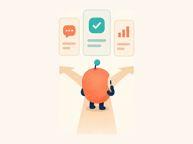
Example: the character remains the same, but the design brief should reflect who is using the app and what emotional state they bring to the screen.
Imagine a budgeting app used by people who are anxious about money. A hyperactive mascot that throws coins in the air may be memorable, but it could make a sensitive moment feel careless. A calm character with small, encouraging gestures is likely to serve the product better.
Before selecting a direction, show rough concepts to five people who resemble your users. Ask what each character seems likely to do, not whether they “like” it. Their interpretation is more useful than a taste score.
3. Define personality before appearance
Personality turns a shape into a character. Choose three traits that influence both visuals and behavior, such as calm, clever, and encouraging. Avoid broad words like “good,” “modern,” or “fun” unless you define what they look and sound like in practice.
Then add boundaries. If the mascot is encouraging, is it quietly supportive or loudly celebratory? If it is clever, can it be sarcastic? If it is playful, should it joke during an error?
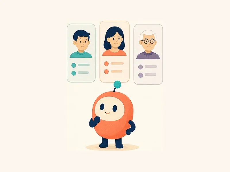
Example: “warm, observant, quietly optimistic” is specific enough to guide facial expressions, posture, motion, and writing without locking the mascot into one emotion.
Create a small behavior table before refining the art:
| Product moment | The mascot should | The mascot should never |
|---|---|---|
| Welcome | Wave and make space for the main action | Block the call to action |
| Error | Stay calm and point toward recovery | Look panicked or blame the user |
| Success | Match the size of the achievement | Celebrate every trivial action |
| Upgrade | Explain value with confidence | Beg, guilt, or pressure the user |
This table is useful for illustration, animation, and interface copy. It helps the mascot behave like one character even when several people create assets.
4. Connect the character to your brand
The mascot should feel like it belongs to your product before someone places a logo beside it. Look for visual DNA you can inherit: shape language, color hierarchy, line weight, corner radius, motion style, or one recognizable brand accent.
Do not force every brand element onto the character. A mascot wearing a branded shirt, hat, badge, and color palette often looks like a promotional costume rather than an original character. One or two structural connections are usually stronger.
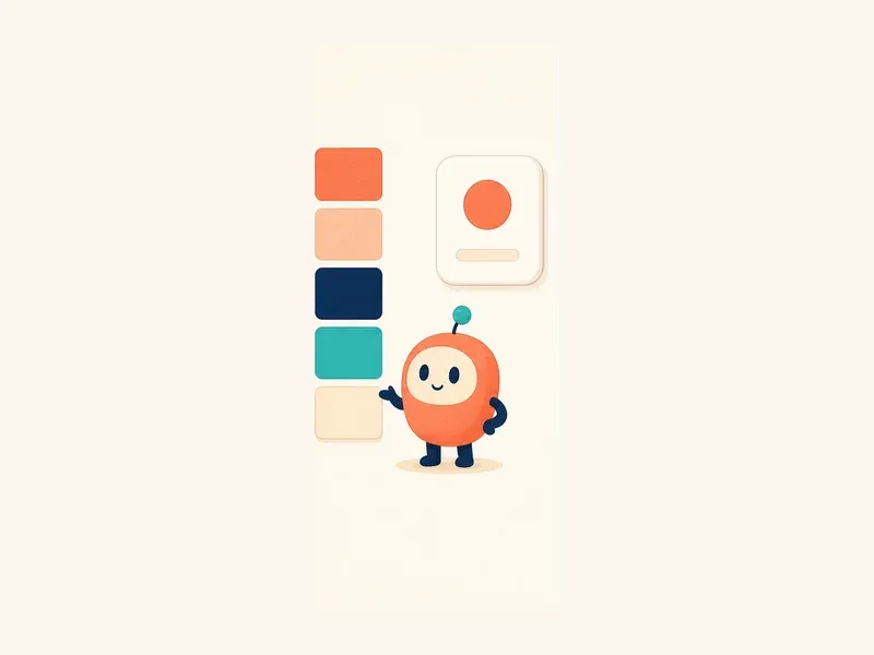
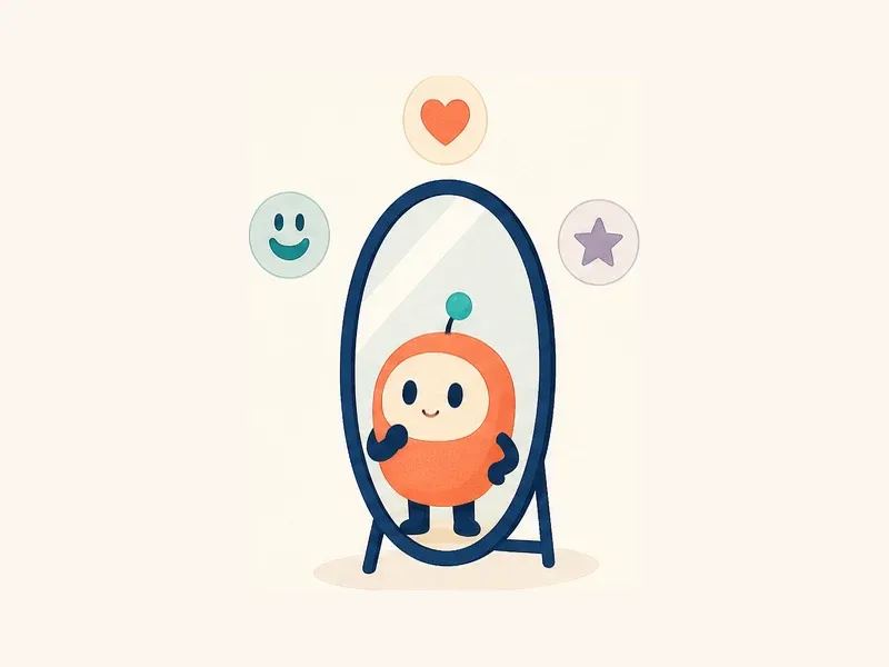
Example: the mascot uses the same coral, navy, teal, and cream hierarchy as the interface, while its rounded body echoes the app tile’s shape language.
Try the “stranger test”: remove the product name and place the mascot beside a screenshot of the app. Do they look as if they came from the same company? If not, decide whether the mismatch comes from color, geometry, polish, energy, or subject matter.
If your visual identity is still taking shape, define the character alongside a small brand personality guide instead of treating the mascot as an isolated project.
5. Keep the design simple enough to remember
Detail can make the first illustration impressive and the tenth illustration inconsistent. App mascots need stable features that survive small sizes, different poses, and quick production.
A practical first character usually needs:
- one dominant silhouette
- a face with fixed proportions
- a limited palette
- simple hands and feet
- one distinctive feature, such as an antenna, ear shape, visor, or tail
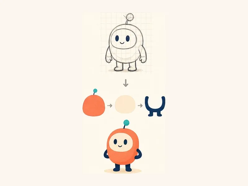
Example: reducing the character to an orange body, cream face, navy limbs, and teal antenna creates a repeatable construction system without removing its personality.
Test the mascot as a solid black silhouette. Then hide accessories and background props. If it becomes generic, strengthen the body shape or one primary feature rather than adding several small details.
Simple does not mean bland. It means the memorable idea is concentrated in a few decisions. For construction techniques, see the guide to simple geometric mascot design.
6. Test every size and context you plan to use
A mascot does not have one final size. It may appear as a 32-pixel notification avatar, a 160-pixel empty-state illustration, and a large onboarding visual. The same full-body asset will not perform equally well in all three.
Create at least three responsive variants:
- Small: a simplified head, face, or silhouette with no tiny props
- Medium: a half-body or compact full-body pose for cards and empty states
- Large: a complete pose with supporting details for onboarding and marketing
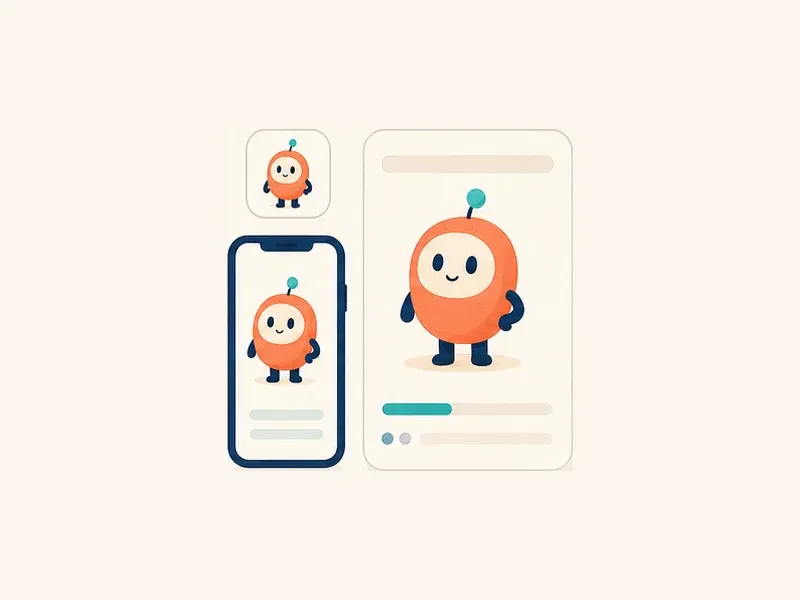
Example: a simplified icon preserves the face, while phone and onboarding placements reveal more of the body. Each version keeps the same identity but uses the available space differently.
Test on light and dark backgrounds, inside a real layout, and next to real copy and controls. Pay attention to gaze and gesture: a pointing pose may direct attention off-screen when the layout stacks on mobile.
Also check crops. A mascot that only works as a full-body character will be harder to use in avatars, chat heads, notifications, and social previews. The app mascot placements guide can help you choose the placements worth testing first.
7. Plan expressions and poses as a system
The neutral hero pose proves the character can exist. The pose library proves it can work.
Start with product needs, not a random emotion list. Most apps can cover their first release with six poses:
- welcome or greeting
- pointing or explaining
- thinking or waiting
- empty or searching
- recoverable error or helping
- success or celebration
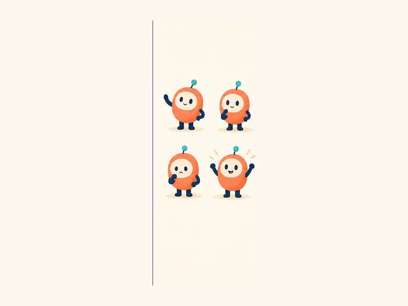
Example: gesture and expression change across four product moments, while the body, face, colors, and antenna remain stable.
Calibrate intensity. A tiny sparkle may be enough for saving a preference; a full jump can celebrate completing a major workflow. When every success receives the biggest pose, the character loses emotional range and the interface becomes exhausting.
Compare new poses side by side with the approved base character. Track head-to-body ratio, eye spacing, limb length, palette, and signature details. The complete mascot poses and expressions guide includes a larger production-ready inventory.
8. Design inclusively and check cultural meaning
The mascot should support understanding without becoming the only way information is communicated. A sad face cannot replace an error message, and a pointing gesture cannot replace a visible label or accessible control.
Review the character for:
- sufficient contrast on light and dark surfaces
- meaning that does not depend on color alone
- readable expressions at the intended size
- gestures that remain appropriate across target regions
- respectful treatment of clothing, bodies, identities, and cultural symbols
- reduced-motion behavior for animated versions
- useful alt text when the image communicates information
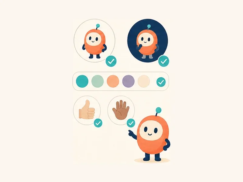
Example: the character is checked on both light and dark fields, the palette is not the only source of meaning, and gestures are reviewed instead of assumed to be universal.
Use empty alt text when the mascot is purely decorative and nearby content already communicates the message. Use descriptive alt text when the character carries information that is not available elsewhere. For animation, avoid essential information that appears only during motion and respect the user’s reduced-motion preference.
Finally, ask reviewers from the regions you serve to look for unintended meanings. Cultural review is more reliable than trying to produce a universally “neutral” character in isolation.
9. Prepare production-ready source files
Approval is not the finish line. The mascot must reach product, marketing, and motion workflows without being recreated from screenshots.
Keep an editable master and define the exports your team will actually use. A practical package may include:
- clean SVG assets for scalable product placement
- transparent PNG or WebP fallbacks where needed
- light- and dark-background versions
- named colors and an approved palette
- consistent view boxes, padding, and alignment
- a predictable folder and file-naming convention
- source files for future poses and animation
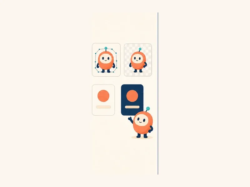
Example: one approved character is prepared as editable vector artwork, a transparent asset, and background-safe exports instead of being handed off as a single flattened image.
Open every export before shipping it. Check transparency, cropping, color mode, embedded raster elements, and file size. Render the SVG in the actual frontend rather than assuming it behaves like the design-tool preview.
If SVG is central to your workflow, use the transparent SVG mascot guide for export and placement checks.
10. Write simple rules for consistent use
The first mascot is usually created by one person. The twentieth asset may be requested by a marketer, generated with AI, animated by a contractor, or placed by an engineer. Guidelines protect the decisions that make all of those assets feel related.
Your first guide does not need to be a large brand manual. One page can define:
- the approved front, side, and three-quarter proportions
- fixed facial features and spacing
- core and optional colors
- allowed accessories and props
- minimum display size and clear space
- expression and motion boundaries
- approved backgrounds
- examples of stretching, recoloring, or redrawing to avoid
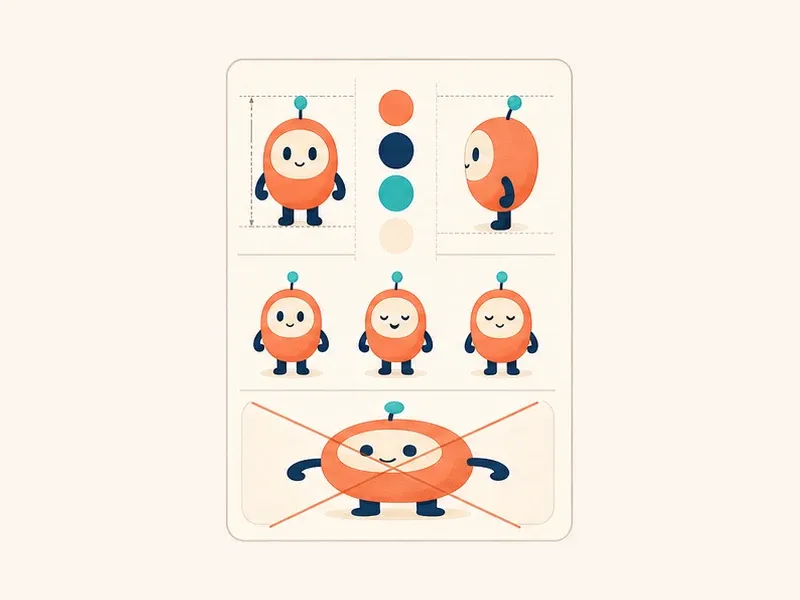
Example: a compact identity lock records what must stay stable and shows one clear misuse, making future production faster to review.
Include the original brief and personality traits in the guide. Visual rules tell people how the mascot looks; behavioral rules tell them why it acts a certain way.
The best test is a handoff: give the guide to someone who did not create the character and ask them to brief one new pose. If their result still looks and behaves like the same mascot, the system is working.
What your first mascot pack should contain
You do not need dozens of poses to launch. A small, disciplined starter pack is more useful than a large collection of inconsistent illustrations.
Aim to approve:
- one short role and personality brief
- one neutral full-body base character
- one simplified small-size version
- six product-specific poses
- light and dark background tests
- an accessible palette with named values
- SVG masters and required raster exports
- one page of usage and identity rules
That package is enough to test the mascot in a real product while leaving room to learn. Add new poses when a repeated user need appears, not simply because another expression would be fun to draw.
A final review before you ship
Put the mascot into the real interface and ask four people to review it from different perspectives:
- Product: Does the character help in this moment?
- Brand: Does it feel recognizably ours?
- Design: Does it remain clear across sizes and themes?
- Engineering: Are the assets accessible, lightweight, and easy to place?
Then show the mascot to a few representative users for five seconds. Hide it and ask what they remember: the shape, color, personality, and likely role. Their answers reveal whether the strongest idea is actually visible.
A successful first app mascot does not need an elaborate backstory or a hundred poses. It needs a clear job, a memorable construction system, and enough production discipline to remain the same character wherever your product needs it.
Turn your mascot brief into a reusable character
Create one consistent app mascot, then build the poses you need for onboarding, empty states, errors, and celebrations.
Create Your App Mascot