Simple Geometric Mascot Design for Apps
A practical guide to designing simple geometric mascots that stay recognizable, customizable, and SVG-friendly across real product screens.
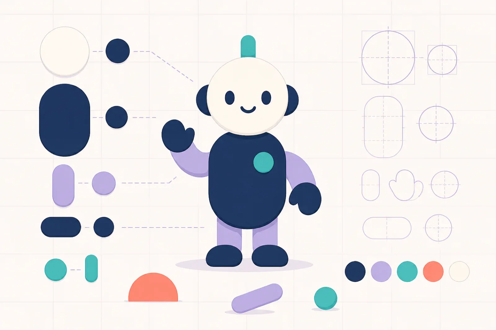
Quick Answer
Simple geometric mascot design works best when the character is built from a few repeatable shapes: a clear body silhouette, stable facial features, limited colors, and pose rules that survive export to SVG.
The goal is not to make the mascot look basic. The goal is to make it easy to recognize, customize, recolor, animate, and reuse in small product moments without visual drift.
For app and SaaS teams, the useful version of a geometric mascot has five traits:
- a recognizable silhouette at small sizes
- simple 2D shapes instead of painterly detail
- a limited palette with one or two brand accents
- consistent face, limbs, and proportions across poses
- transparent or clean backgrounds for product UI placement
That is why a geometric mascot often outlasts a more detailed character. It behaves more like a design-system asset and less like a one-off illustration.
This guide focuses on the mascot’s visual construction system: silhouette, face, reusable parts, and shape constraints. For the complete creation workflow, use the app mascot generator guide; for a list of product-ready poses, use mascot poses and expressions.
Why Geometric Mascots Work in Product UI
Product mascots have to live in cramped places: onboarding panels, empty states, help drawers, docs pages, release notes, and small social previews. Those placements punish detail.
Tiny gradients disappear. Complex hands become noise. Decorative backgrounds compete with buttons. A simple mascot made from circles, rounded rectangles, clean outlines, and broad color blocks keeps its personality when the layout gets tight.
Geometric mascots also make future production easier. When the character is based on stable shapes, new poses can reuse the same head, face, torso, hands, and accent rules. That gives designers and AI tools fewer chances to accidentally redesign the character.
If you are still deciding where the character belongs, start with where to place a mascot in your app before creating dozens of poses.
The Core Shape System
Start by defining the mascot as a small kit of parts. This makes the character easier to reproduce across prompts, SVG exports, and design files.
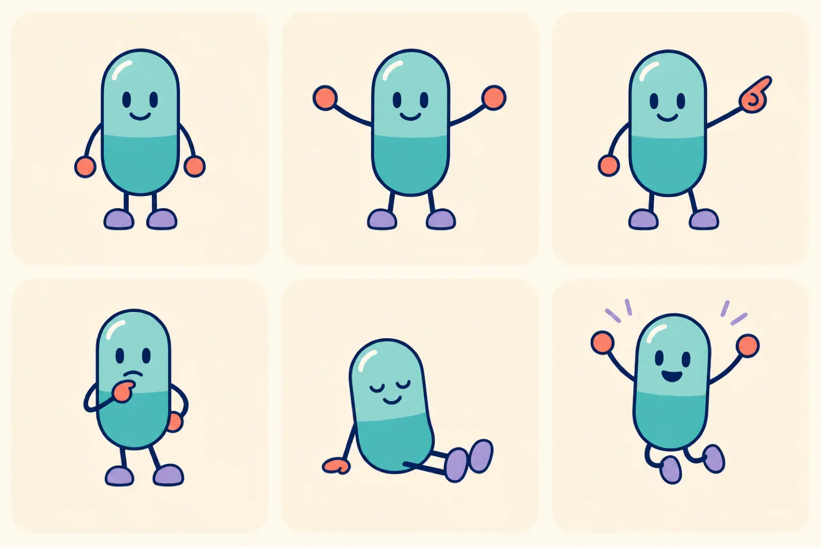
The pose set above changes the gesture and expression while preserving the capsule body, face spacing, outline, palette, and feet. That is the standard to aim for: variation in meaning without variation in identity.
Silhouette
The silhouette is the outline people remember when details are gone. Pick one dominant body shape and commit to it:
- round and friendly
- tall and helpful
- square and dependable
- triangular and energetic
- soft capsule shapes for calm product guidance
Avoid mixing every shape language at once. A mascot with a round head, angular body, sharp hands, and irregular feet can still look interesting, but it becomes harder to keep consistent.
Face
The face should be simple enough to survive at favicon scale. Use a small set of repeatable features:
- two eyes with fixed spacing
- one mouth style with a few expression variants
- eyebrows or eyelids only when they add clear emotion
- one distinctive detail, such as a cheek mark, visor, or accent shape
Do not rely on tiny eyelashes, texture, or detailed teeth to carry personality. Those details usually vanish in SVG thumbnails and mobile UI.
Hands and Feet
Hands are where many mascot systems drift. Keep them simple and reusable. Mitten-like hands, rounded paws, blocky gloves, and simple line arms are easier to pose than fully articulated fingers.
Feet should follow the same logic. They need to anchor the character, not become a new design problem in every pose.
Make It Customizable Without Breaking Recognition
Customizable mascot design does not mean every part should change. It means you decide which parts may change and which parts must stay fixed.
Keep these elements fixed:
- head shape
- eye treatment
- body proportions
- main silhouette
- line weight or edge style
- core expression vocabulary
Allow these elements to adapt:
- scarf, badge, shirt, or small accessory color
- one brand accent color
- prop choice for a specific product moment
- pose and gesture
- background shape, if any
This balance lets the mascot feel tailored to a brand without losing identity. A product team can recolor the accent, add a feature-specific prop, or create a new empty-state pose while the character still reads as the same mascot.
For a broader system view, read how to create a mascot for your app and consistent mascots with AI.
A Prompt Template for Simple Geometric Mascots
Use a prompt that describes the design rules, not just the character idea.
Create a simple geometric 2D mascot for [product type].
The mascot should have a clear rounded silhouette, large readable eyes,
simple mitten-like hands, short legs, and one small brand accent.
Use clean SVG-friendly vector shapes, flat colors, limited shading,
transparent background, no text, and no detailed scenery.

Brand personality: [calm, clever, warm, technical, playful, premium]
Primary color: [hex or color name]
Accent color: [hex or color name]
Use case: [onboarding, empty state, success, docs, launch post]
The important part is the constraint set: geometric, 2D, SVG-friendly, limited shading, transparent background, no text. Those instructions reduce the chance of getting a beautiful image that is impossible to reuse.
Pose Checklist
Before generating a full mascot set, create a small pose map. Each pose should answer a product need.
Starter Poses
- welcome pose for onboarding
- pointing pose for feature education
- thinking pose for empty states
- fixing or helping pose for errors
- celebration pose for success moments
- reading pose for docs or help
Consistency Checks
For every pose, compare it against the base character:
- Is the head shape still the same?
- Are the eyes in the same style?
- Did the body proportions change?
- Is the accent color still used in the same way?
- Would the mascot still be recognizable without the background?
- Does the SVG remain simple enough to recolor or animate?
If the answer is no, tighten the prompt before making more assets. It is cheaper to fix the base system than to repair a messy pose library later.
Once the geometric identity is stable, use the mascot poses and expressions guide to map that character system to product states without changing its construction rules.
Common Mistakes
Starting With Too Much Detail
Detailed mascots can look impressive in a hero image, but they often fail in product UI. Start simpler than feels necessary. Add detail only if it improves recognition or emotional clarity.
Changing the Character for Every Pose
If each pose has a new face, new body, and new color logic, users do not learn the mascot. They see unrelated illustrations. Keep the character stable and let the gesture carry the moment.
Treating Geometric as Generic
Simple shapes still need a point of view. Choose one distinctive trait: a wide stance, unusual head shape, oversized eyes, small cape, badge, antenna, or signature accessory. One memorable detail is stronger than ten decorative ones.
Ignoring the Export
If the final asset needs to be SVG, design for SVG from the beginning. Avoid raster texture, soft lighting, hairline details, and complex layered effects unless they are essential.
When to Use a Geometric Mascot
A simple geometric mascot is a strong fit when your product needs:
- reusable app illustrations
- clean SVG exports
- onboarding and empty-state assets
- brand characters that can be recolored
- lightweight animation in another tool
- consistent social or launch visuals
It may be a weaker fit if your brand depends on highly rendered fantasy art, realistic portraiture, or detailed world-building. In those cases, a geometric mascot can still work, but it should be intentionally stylized rather than used as a shortcut.
FAQ
What is a simple geometric mascot?
A simple geometric mascot is a character built from clean 2D shapes, limited colors, and repeatable proportions. The design is usually easy to recognize, recolor, export, and reuse across product screens.
Are geometric mascots good for SVG?
Yes. Geometric mascots are usually easier to convert into clean SVG because they use flat shapes, readable silhouettes, and fewer raster-style effects.
How many colors should a geometric mascot use?
Most teams should start with three to five colors: one main body color, one neutral, one shadow or outline color, and one or two brand accents.
Can AI create consistent geometric mascot poses?
Yes, but only if the base character and prompt rules are specific. Lock the silhouette, face, proportions, palette, and SVG-friendly style before asking for many poses.
Create a mascot that works as a system
Use svgapp to generate simple, reusable mascot assets for onboarding, empty states, docs, success screens, and launch moments.
Create Your Mascot